4.2 Synchronizable Views
The project workspace can contain multiple views. These views provide various data presentations for visual analysis and troubleshooting. The views are categorized as synchronizable views and
Summary data views.
Synchronizable views simultaneously display data that was collected at the same moment. All of these views can be viewed while playing back drive test data. Synchronizable views include:
Two synchronization modes are available:
 Mouse Moving Mode
  Mouse Clicking Mode
 Once the data point in a view is identified, whether by mouse hovering or mouse clicking, the related information will be synchronized and highlighted in all other synchronizable views.
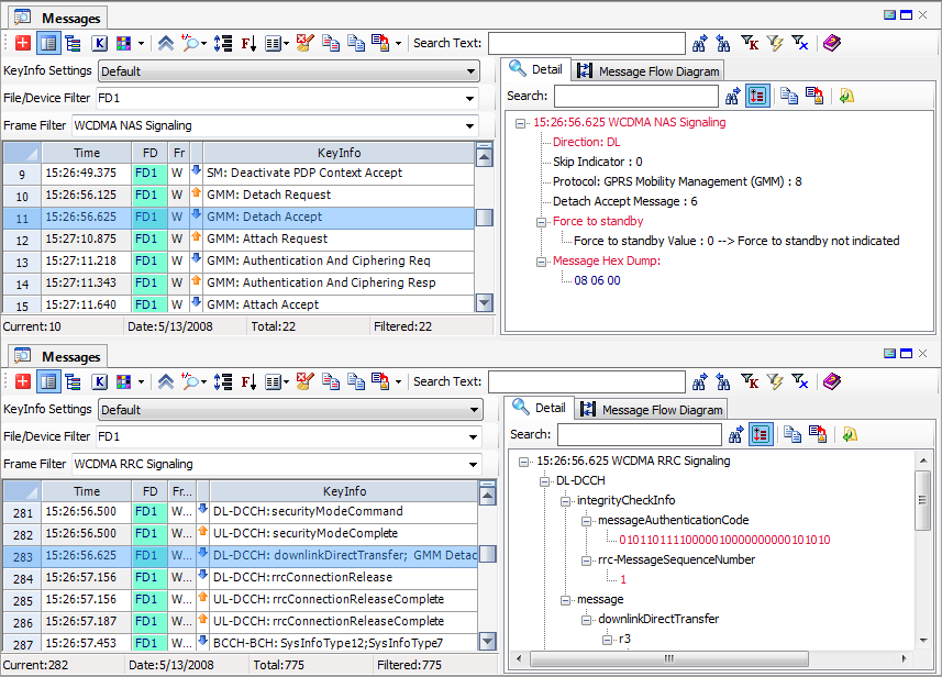
4.2.1 Messages View

The Messages View contains two panels.
The left panel is a spreadsheet that lists the message in time sequence. The information in the spreadsheet can include the timestamp, date, File/Device ID, frame name, direction, and configurable key information for the message (columns are selected with the
Message Header Column Selector button

on the Messages View toolbar).
The right panel holds the Detail View and the Message Flow Diagram. The Detail View can be a spreadsheet or a tree view, depending on what information is displayed. The Message Flow Diagram displays a user-defined message cycle in diagram form.
You can show or hide the Detail View/Message Flow Diagram by clicking the
Detail/Diagram View 
button on the Messages View toolbar.
For information to be listed in the KeyInfo column, you can define many KeyInfo settings and select one of the settings from the KeyInfo Settings combo box.
Click the
KeyInfo Settings button

to access the
Messages View KeyInfo Settings dialog.
To format a particular message with color, click the
Layer 3 Message Coloring button

to launch the
Message Coloring settings dialog and choose a color for that message.
4.2.1.1 Messages View Toolbars
Summary View Toolbar
| Create New Message View |
| Detail/Diagram View. Show or hide the right-side panel (Detail View). |
| Layer 3/RRC IE Browser. Open the Signaling Message Browser. |
| KeyInfo Settings. Open the Messages View KeyInfo Settings dialog. |
| Layer 3 Message Coloring. Open the Message Coloring settings dialog dialog. |
| Show/Hide Extra Options. Show/hide the KeyInfo Settings, File/Device Filter, and Frame Filter settings. |
| Zoom Spreadsheet. Zoom in or out of the spreadsheet. |
| Enable/Disable Auto-Adjustment of Column Height. |
| Group Messages by File/Device. |
| Message Header Column Selector. Select the columns to be included in the message header. Options: Time, FD, Frame Name, Direction, and KeyInfo. |
| Clean Spreadsheet. Clean up the spreadsheet. |
| Copy Selected Summary. Copy the selected message in the spreadsheet to the Clipboard. The message can then be pasted to a text editor outside of TEMS Discovery. To select one or more messages, left-click the first message, and hold down the mouse to select other messages. |
| Copy All Summary. Copy all messages in the spreadsheet to the Clipboard, from which they can be pasted to a text editor outside of TEMS Discovery. |
| Export Summary to Text • Export all messages displayed in the spreadsheet to a tab-delimited text file. • Export all messages, including their decoded detail information, to a text file. |
| Search Forward. Find the next message containing the text phrase defined in the text box. |
| Search Backward. Find the previous message containing the text phrase defined in the text box. |
| Filter. Apply a filter and display only the messages whose KeyInfo contains the text phrase defined in the text box. |
| Filtering per Selected Layer 3 Message Type. Apply a filter and display only the messages selected by the user in the spreadsheet. |
| Remove Filter. Remove the filter and display all loaded messages. |
| Help. |
Detail View Toolbar
| Search Next. Find the next content containing the text phrase defined in the text box. |
| Expand/Collapse Tree View. |
| Copy All Detail. Copy all content in the spreadsheet or tree view to the Clipboard to paste them to a text editor outside of TEMS Discovery. |
| Export Detail to Text File. Export all content in the spreadsheet or tree view to a tab-delimited text file. |
| Close Detail/Diagram View. |
4.2.1.2 Display Messages
Messages can be sent from the
Data Explorer to the Messages View in two ways:
5. Select a data object and drag-and-drop it into the Messages View.
6. Right-click a data object and choose Send to Messages View from the context menu.
4.2.1.3 Navigate Messages
Each row in the spreadsheet on the left represents one message, detailing the information for a corresponding message that can be displayed in the Detail View on the right. To show or hide Detail View, click the
Detail/Diagram View button
on the toolbar. Or, as a shortcut, double-click any row in the spreadsheet to show the Detail View with detail information for the selected message.
The Page and Arrow buttons on your keyboard (Page Up, Page Down, Arrow Up, and Arrow Down) can be used to navigate messages in the spreadsheet.
4.2.1.4 Filter Messages
Messages displayed in the spreadsheet can be filtered in four ways.
• By Key Info

If you input a text phrase in the
KeyInfo text box and then click the
KeyInfo Filter toolbar button, the spreadsheet will display only the messages whose KeyInfo contains the specified text phrase.

If you click the
Remove Filter button in the toolbar, the filter will be removed and all messages will be displayed.
You can input multiple text phrases in the KeyInfo text box, with double quotation marks and connected with a plus sign (+). For example, with the text phrases "key info 1"+"key info 2", only messages whose KeyInfo contains either "key info 1" OR "key info 2" will be displayed.
• By File/Device ID
If any data is displayed in the Messages View, TEMS Discovery will dynamically assign a sequence ID (FD-xx) to its associated file/device, and list that ID in the File/Device filter combo box at the top of the spreadsheet. You can make multiple selections in the dropdown list to display only the selected file/device.
• By Frame Name
The combo box at the top of the spreadsheet lists all the names of the frames and scripts displayed in the spreadsheet. You can make multiple selections in the dropdown list to display only the selected frames/scripts.
• By Selected Message

If you select a message in the spreadsheet and then click the
Filter toolbar button, the spreadsheet will display only the selected message.
If you click the
Remove Filter button in the toolbar, the filter will be removed and all messages will be displayed.
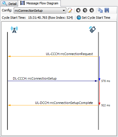
4.2.1.5 Message Flow Diagram
The Message Flow Diagram displays the user-defined message cycle in diagram form.
A message cycle can be built from (and only from) the Layer 3 signaling messages listed in the message summary view on the left panel, based on the user-defined message cycle configuration.
Message Flow Diagram Toolbar
| Edit Message Cycle Configuration. Access the Message Cycle Configuration dialog. |
| Display Message Flow Containing the Selected Message. Display the message cycle that contains the message currently selected in the message summary spreadsheet. |
 or  | Display Previous or Next Message Flow. Display the previous or next message cycle, starting from the cycle start time shown beneath the toolbar. This cycle start time will be automatically updated after a message cycle is built and displayed. |
| Copy Diagram. Copy the displayed diagram to the Clipboard for pasting to any external application. |
| Save as Image. Save the displayed diagram as an image file. |
| Set Cycle Start Time. Manually select a Layer 3 signaling message in the message summary spreadsheet and click this button to set a specific start time for building a new message cycle. |
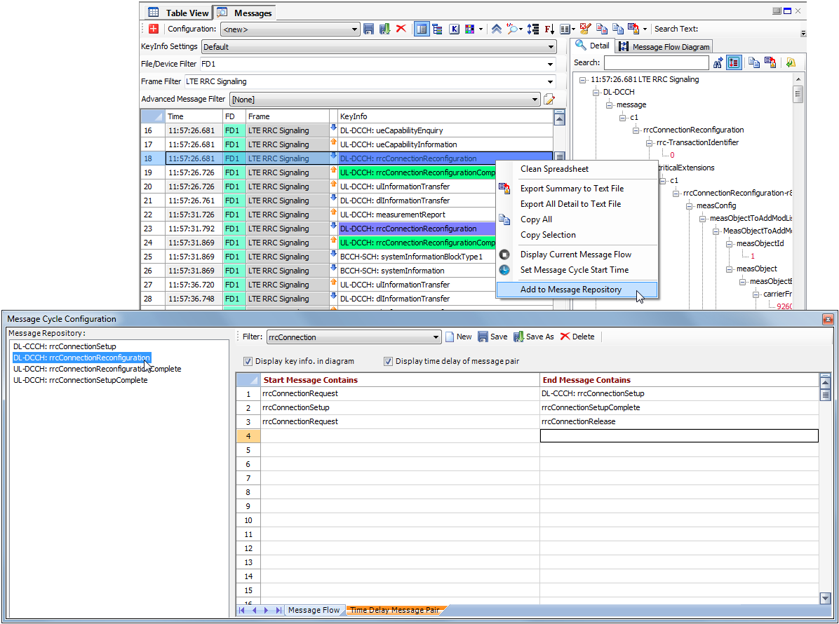
Message Cycle Configuration
The message cycle is defined in the Message Cycle Configuration dialog. User may display all key information associated with the messages in diagram, and/or display time delay of selected message pair.
• Message Cycle Configuration dialog is accessed by clicking the

button in the Message Flow Diagram toolbar.
• The message cycle starts with a message/event that contains any of the text phrases listed in the column Start Message/Event Contains.
• The message cycle ends with a message/event that contains any of the text phrases listed in the column End Message/Event Contains.
• All the messages/events in between the start and end of the message cycle will contain any of the text phrases listed in the column Other Message/Event Contains.
• The message time delay will be calculated based on the message pair defined in the Time Delay Message Pair sheet. Each row represents one message pair.
• Specific messages may be available in Message Cycle Configuration using Add to Message Repository right click context menu option. Messages added to Message Repository area can be dragged-and-dropped to any of fields in Message Flow or Time Delay Message Pair tabs.
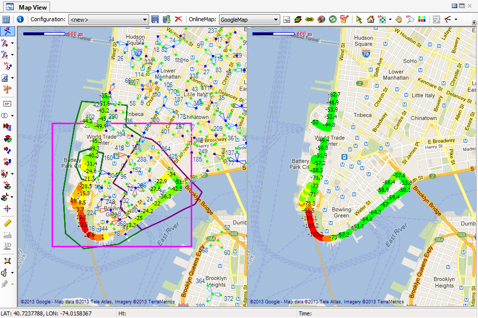
4.2.2 Map View

The Map View is a multi-layer display that can display multiple datasets, multiple cell configurations, and multiple GIS images or online Map in the same view. Data can be displayed in the Map View in the following ways:
• Drag-and-drop a data object from the
Data Explorer into the Map View.
• Right-click a data object and choose Send to Map View from the context menu.
Click any data point on the Map View to display detail information in the tooltip.
4.2.2.1 Map View Toolbar
| Table Size. Display a table size selector for creating multiple Map Views. Multiple views can be synchronized by clicking the Synchronization button . |
Combo box | List the available configurations. Each configuration defines the collection of metrics to be loaded and in which sub-view to load them. When sending/dragging a file/device to the Map View with a configuration selected, the currently defined data filtering options will be applied. |
| Save Configuration. Save the currently displayed metric and its location as a configuration. |
| Save Configuration As. Save the currently metric configuration as a new configuration. |
| Delete Selected Configuration. Delete the selected configuration. |
Combo box | OnlineMap. List the available online map data source that you have been licensed including Google, Bing and Baidu maps. |
| Draw GIS in Grayscale. Display the GIS image in grayscale |
| Layer/View Option. Open the Map View Options dialog. See Layer/View Options. |
| Turn On/Off Subview Synchronization Mode. Synchronize all Map sub-views created by the Table Size button  . |
| Download TerraServer Image/Maps. Download an online GIS data source. See Download Online GIS Data Source. |
| Refresh Display to Apply Current Data Filters. Apply the new data filtering options defined in the Data Explorer and refresh the display. |
| Cleanup All Layers. Clean up the display. |
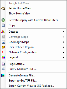
| Pointer. Change the cursor to a pointer. Right-clicking the screen will bring up the pop-up menu shown below: | Toggle Full View. This menu will only be enabled when multiple Map Views are displayed. Choosing this menu maximizes the current Map View, or restores the Map View to its original state if the current view is maximized. Set As Home View. Save the current view port as Home View. Show Home View. Restore the view port to Home View. Refresh Display with Current Data Filters. Apply the new data filtering options and refresh the display. Copy. Copy the current display to the Clipboard to paste it outside of TEMS Discovery. Coverage Maps. Coverage maps exported from external planning tools. GIS Image/Maps. See GIS in Map View. | User Defined Region. See GIS in Map View. Network Configuration. See Cells in Map View. Legend. Show or hide the legend display. Page Setup. Page setup for print-out or PDF generation. Print / Generate PDF. See Create Output. Generate Image File. See Create Output. Export to GeoTIFF File. See Create Output. Export Current View to GIS Package. See Create Output. |
|
| Home View. Reset the current view port to a pre-defined Home View. To define the Home View, right-click on the Map View and choose Set as Home View from the pop-up menu. |
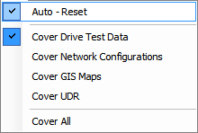
| Reset. | Reset all Map Views to the view port that covers the bounding rectangle of the user-selected loaded data in that view. If the Auto-Reset option is selected, the view port will be automatically reset at each time you drag-and-drop new data to that view. |
|
| Pan. Pan view to user-selected direction and distance. |
| Zoom In/Out. 1. To zoom in, left-click the desired location, which will be used as the center for the zoom in. 2. To zoom out, right-click the location, which will be used as the center for the zoom out. 3. Left-clicking and holding will draw a rectangle that will zoom in the view port to the area within the rectangle. 4. Right-clicking and holding will draw a rectangle that will zoom out of the view port to that area within the rectangle. |
| Unzoom. Undo the last zoom action. Clicking the Reset button will clear the history of previous zoom actions. |
| Show/Hide Legends. Show or hide the legend in the Map View. |
| Indoor Mode. |
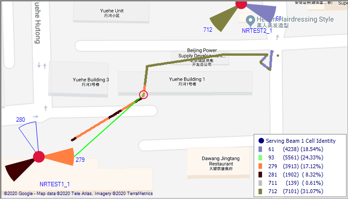
| Spider Move. Displays ray lines that link the data point to the appropriate sector for serving and neighbor sites, based on PCI/NRARFCN (NR), PCI/EARFCN (LTE), PSC/UARFCN (WCDMA), PN (cdma2000/EVDO) or BCCH/BSICH (GSM). The ray lines can be built based on phone data or scanner data. 1. Use Phone Data. 2. Use Scanner Data |
| Cell Radius Analysis. Click at a sector to perform cell radius analysis. |
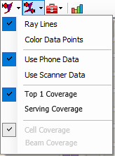
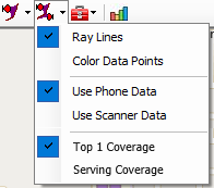
| Sector Coverage IntelliSense. Click at a sector to view its coverage (sector selection list will pop-up in case multiple co-located sectors are present). Coverage can be visualized by one of the following options: ⋅ Ray Lines – displays ray lines from sector to drive route ⋅ Color Data Points – coverage measurement points marked in selected sector’s color Coverage can be based on Phone (UE) or Scanner data. Coverage can be based on Top 1 sector or serving sector measurements. Serving sector coverage is by default based on serving cell measurements (i.e. ‘Cell Coverage’ sub-option), while ‘Beam Coverage’ sub-option may be selected for 5G NR UE data to visualize individual serving beams. |
| Sector Coverage. Show or hide all sectors' coverage. Same visualization, data type and coverage type options are supported. |
| Utilities  Spotlight on UDR Spotlight on UDR. Lower the light of the surrounding area to stand out the UDR area. |
| Add to Report Template Builder Repository. $$$ Converts populated Map View into report element definition and adds it to Report Template Builder Repository. |
| 3D View. Launches 3D Map View based on Google 3D map information. |
| Street View. Launches Street View based on Google Street View map information. |
| Data Route Offset. If more than two data routes are displayed, you can toggle this button to apply or not apply the screen offset for all data routes displayed. |
| Dataset Routes Distance. If more than two data routes are displayed: 1. Left-click to increase the screen offset of the data routes. 2. Right-click to decrease the screen offset of the data routes. You can also select a Coarse or Fine Tune option for the screen offset adjustment. |
| Dataset Routes Position. If more than two data routes are displayed: 1. Left-click to rotate the data routes, whose screen offset are not zero, clockwise. 2. Right-click to rotate the data routes, whose screen offset are not zero, counterclockwise. You can also select a Coarse or Fine Tune option for the dataset route position adjustment. |
| Data Point Icon Size: 1. Left-click to enlarge the icon size of a data point. 2. Right-click to reduce the icon size of a data point. |
| Data Label. Display value of data points on the view. |
| Data Label Offset. Toggle the button to enable and disable offset between data points and labels for all data routes displayed. |
| Dataset Routes Distance. If data label offset is enabled: 1. Left-click to increase the screen offset between data points and corresponding labels. 2. Right-click to decrease the screen offset between data points and corresponding labels. You can also select a Coarse or Fine Tune option for the screen offset adjustment. |
| Dataset Routes Position. If data label offset is enabled: 1. Left-click to rotate data labels clockwise. 2. Right-click to rotate data labels counterclockwise. You can also select a Coarse or Fine Tune option to determine step size of data label position adjustment. |
| Dataset Route Direction. Show or hide the direction of the drive test. |
| Sector Selector/De-selector: 1. Left-clicking a sector will trigger an active flag. 2. Left-click and hold to draw a rectangle that selects all sectors within that rectangle. The selected sectors will be highlighted with a grid in the pie. 3. Right-click and hold to draw a rectangle that de-selects all sectors within that rectangle. 4. Right-clicking the screen will bring up a pop-up menu with the following options: • Save flagged sectors as group. Save the selected sectors to a sector group. • Remove all flags. Clear the sector highlighting. |
| Search for specific metrics, as specified by the dropdown menu: |
| Pin-point Sector Logical Display. Left-click a site/sector to ensure the visibility of its corresponding logical display in the tree view in the Data Explorer–Cells List. Sector selection list will pop-up in case multiple co-located sites are present. |
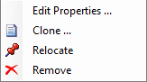
| Cell Site Property. Left-click a site or sector to bring up the dialog to view or edit site/sector properties. Site selection list will pop-up in case multiple co-located sites are present. See Cell Site Properties for more information. Right-click on a site/sector to bring up the following context menu: | Edit Properties. Edit properties of the clicked site. Clone. Clone the clicked site. Relocate. Relocate the clicked site. Remove. Remove the clicked site. |
|
| Neighbor List IntelliSense: 1. Moving the mouse over a sector will show ray lines that link to neighboring sectors. 2. Right-clicking the screen will bring up a pop-up menu. Choose Network configuration > Freeze the current NL display, Remove the selected NL display, or Remove all NL display to manipulate the display of ray lines. |
| NL Serving Sector Selector. Pick a sector as a serving sector of the neighbor list. |
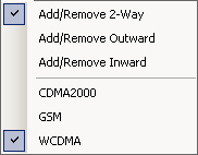
| Edit Neighbor List. Edit the neighbor list for the serving sector picked by  . You need to select what kind of neighbor to add or remove from the dropdown menu. | 1. Left-click on a sector to pick. 2. Right-click on a sector to remove. |
|
| Cell Site Icon Size. Left-click to enlarge the cell site icon. Right-click to reduce the cell site icon. |
| Cell Site Label. Shortcut for site/label display options. See Cell Configuration View Options. |
| View Antenna Pattern. Click a sector to view its antenna pattern. See Antenna Pattern Viewer. |
| Measurement Tool: 1. With this tool activated, measure distance by pressing and holding the left mouse button to draw a path. 2. Click on a path to select it. 3. If a path is selected, press and holding one end of the path to modify it. 4. Delete a path by double-clicking it. 5. Right-clicking the screen will bring up a a pop-up menu with the following options: • Clear This Path. Remove the selected path. • Clear All Paths. Clear all paths. |
| Terrain Path Profile: 1. Display the terrain path profile in the lower panel of Map View by left-clicking and holding to draw a path. See Terrain Profile. 2. Click on a path to select it and display the terrain path profile for that path. 3. If a path is selected, left-click and hold one end of the path to modify it. 4. Delete a path by double-clicking it. 5. Right-clicking the screen will bring up a a pop-up menu with the following options: • Clear This Path. Remove the selected path. • Clear All Paths. Clear all paths. |
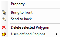
| UDR Selector: 1. Left-click a UDR to select it. Once the UDR is selected, a number of small black squares will appear around the UDR. 2. Once the UDR is selected, left-click and hold its point to modify the selected UDR. 3. Right-clicking the screen will bring up the following pop-up menu. | Property Edit the properties of the selected UDR. Bring to front Bring the selected UDR to the front of other UDRs. Send to back Send the selected UDR to the back of other UDRs. | Delete selected Polygon Delete the selected polygon. User-defined Regions The next level of the pop-up menu contains: New, Save, Save as, and Close. The drawn UDR can be saved to a named GIS area, or saved as a new GIS area. The displayed GIS area can be closed (removed from view). |
|
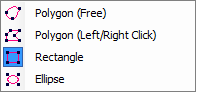
| UDR Drawing: 1. Select the shape from the dropdown menu: polygon (free), polygon (left/right click), rectangle, or ellipse. Draw the UDR, as desired. 2. Left-click a UDR to select it. Once the UDR is selected, a number of small black squares will appear around the UDR. 3. Once the UDR is selected, left-click and hold its point to modify the selected UDR. 4. Right-clicking the screen will bring up the same pop-up menu described above for the UDR Selector. |
| Vector Feature Selector: 1. To use this tool, the terrain vector data must be displayed in the Map View. By left-clicking a location on the map, a list of available area features will be listed in the pop-up menu. You can pick an area feature to highlight. 2. Right-clicking the screen will bring up a pop-up menu with the following options: • Add the highlighted area to UDR. Add the highlighted area feature to UDR. By switching the mouse mode to (  ), you can manipulate the newly added UDR as a user-drawn UDR, and save it to a GIS area. • Clear the area highlighting. Clear the area highlighting. |
| Help. |
4.2.2.2 Dataset in Map View
Context Menu
Right-clicking the screen and selecting Network Configuration from the context menu will bring up a pop-up menu with the following options:
• Remove Data Point to Sector Links. When playing back drive test data, the ray lines linking the data points to their appropriate serving sectors can be kept permanently. Choose this menu to remove those lines.
• Remove Curves. Remove one or all curves from the Map View.
Display Metric
To display a dataset in the Map View, drag-and-drop the data object from the
Data Explorer into the Map View, or right-click on the data object and choose
Send to Map View from the pop-up menu.
Modify Appearance
Multiple metrics can be displayed side by side in the Map View with certain screen offsets. Use the tools provided in the toolbar (

,

,

,

) to adjust the appearance of the metrics in the Map View and to obtain the best visual effects. See
Map View Toolbar for more information.
Click the
Dataset Route Direction button

to display black arrows indicating the drive test direction.
You can also assign a plot band to the metric so that it is displayed in different colors. See
Data Explorer for more information on how to assign a plot band to a metric.
Remove Metric from Display
To remove one or all metrics from the display, right-click the screen and select Dataset > Remove Curves from the context menu. From the list of existing curves displayed in the Map View, select All to remove all curves, or select a particular curve to remove it.
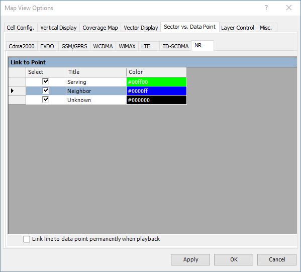
Links to Serving Sector
The toolbar button

activates the
Spider Movement Tool. When the cursor is passed over a data point, colored ray lines will be appear if the version of cell sites is displayed. The ray lines link the data point to its appropriate serving sectors. From the
Sector vs. Data point tab in the
Map View Options dialog, you can define the color for links and the conditions for showing the links.
4.2.2.3 Cells in Map View
Context Menu
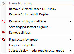
Right-clicking the screen and selecting Network Configuration from the context menu will bring up the following menu:
| Freeze NL Display. Keep the current NL display (ray lines) permanent. Remove Selected Frozen NL Display. Remove the frozen NL display (ray lines) from the selected serving sector (the sector that was right-clicked). Remove All Frozen NL Display. Remove all frozen NL displays from the screen. Remove All Cell Site Flags. Remove all cell site flags from the screen. |
Remove Display of Cell Sites. Remove a version of cell sites from the screen. Save highlighted sectors as group. To highlight sectors, click the Sector Selector/De-Selector  button. Flag sectors by group. Highlight the sectors with flags in the sector group. Flag sectors by filter. Search sectors based on the filter defined and highlight the sectors found with flags. Subset display mode: toggle sector group. In subset display mode, only the selected number of sector groups will be displayed in the Map View. Select this menu to toggle the display of the selected sector group in the Map View. |
Display Version of Cell Sites
To display cell sites in the Map View, drag-and-drop a version of cell sites from the
Data Explorer into the Map View, or right-click on the version and choose
Send to Map View from the context menu.
Modify Appearance
Multiple versions of cell sites can be displayed side-by-side in the Map View.
The icon size can be enlarged or reduced by left-clicking or right-clicking the
Cell Site Icon Size button

on the toolbar.
Clicking the
Layer/View Option button

on the toolbar will bring up the
Map View Options dialog. In the Cell Configuration tab, you can modify the options for displaying cell/sector labels.
The dropdown toolbar at the
Cell Site Label button

provides a shortcut for selecting label display options.
Additionally, the view options for the version of cell sites can be edited by right-clicking the version in the
Data Explorer and choosing
Edit View Options from the pop-up menu. In the Cell Configuration View Option dialog, you can modify the plot band for the cell site or sector icon, the labels to display, and the color of the labels. See
Cell Configuration View Options for more information.
Remove Version of Cell Sites
To remove one or all versions of cell sites from the display, right-click the screen and select Network Configuration > Remove Display of Cell Sites from the context menu. From the list of existing versions of cell sites displayed in the Map View, select All to remove all versions, or select any particular version to remove it.
Edit Cell/Sector
To edit or view the properties of a cell site or sector, click the
Cell Site Property button

on the toolbar to activate the Edit Cell Site/Sector tool; then left-click on a cell site or sector in the Map View to display the Properties of Cell Site dialog. Edit the properties and save. See
Edit Cell/Sector Parameters for more information.
Sector Antenna View
Click the
View Antenna Pattern button

on the toolbar to activate the Antenna Pattern Viewer tool, then left-click a sector to bring up the
Antenna Pattern Viewer,
where you can view that sector’s antenna pattern.
Neighbor List
TEMS Discovery provides direct operations to graphically edit the neighbor list.
Click the
NL Serving Sector Selector button
on the toolbar to activate the Pick Serving Sector tool. Then, click on a sector to pick that sector as the serving sector for editing the neighbor list. If the serving sector has neighbors, ray lines will link the serving sector to its neighbors.
Before editing the neighbor list, click the
Edit Neighbor List button

on the toolbar to activate the Edit Neighbor List tool. Then, to add a neighbor sector for the serving sector, select the appropriate properties from the dropdown buttons and left-click the sector. To remove a sector from the neighbor list, right-click the sector.
Click the
Neighbor List IntelliSense button

on the toolbar to activate the Neighbor List IntelliSense Tool. When this tool is active and the cursor is passed over a sector with a neighbor list, ray lines that link the sector to its neighbors will appear. You can modify the color of the lines in the
Cell Configuration tab in the
Map View Options dialog. To freeze the ray lines for the current serving sector, right-click and choose
Network Configuration > Freeze NL Display from the context menu
. To remove a frozen neighbor list display, right-click the serving sector and choose
Network Configuration > Remove Selected NL Display. Choosing
Remove All NL Display will remove all neighbor list displays from screen.
Create Sector Group
Metric data can be filtered by its serving sectors. In the Filtering Options of the
Data Explorer, the sector group is applied for such purposes.
To create a sector group, click the
Sector Selector/De-selector button
on the toolbar to activate the Sector Selector tool that allows direct operation on the cell sites displayed in the Map View. See
Map View Toolbar for how to select sectors and save the selected sector as a sector group.
Another way to create a sector group is to search for sectors that meet a certain criteria of so-called filters. Filters can be created or edited as follows:
After the filter is created, right-click the screen and select
Network Configuration > Highlight sectors by filter; after doing so, right-click again, and select
Network Configuration > Save highlighted sectors as group to save it as a group. Another way to highlight the filtered sectors is from the
Cell Configuration Editor dialog.
After the filter is applied and the sectors found are listed in the spreadsheet, click the
button on the toolbar to highlight the found sectors on the Map View, then save the highlighted sectors as a group, or click
Save As 
to save the filtered sectors as a sector group.
Display Sector Coverage
Click the

button on the toolbar to activate the Sector Coverage tool. Then, click on a sector displayed in the Map View to display its coverage. To display the coverage of all sectors, click the

button on the toolbar.
4.2.2.4 GIS in Map View
Context Menus
Right-clicking the screen and selecting GIS Image/Maps from the context menu will bring up a pop-up menu with the following options:
• Remove GIS Image/Maps Layers. Remove one or all GIS image/map layers from the display.
• Remove GIS Image/Maps Packages. Remove one or all GIS image/map packages from the display.
Right-clicking the screen and selecting User Defined Region from the context menu will bring up a pop-up menu with the following options:
• New. Create a new UDR.
• Save. Save the opened UDR.
• Save As. Save the opened UDR as a new UDR.
• Close. Close the opened UDR.
Display Metric
To display GIS data in the Map View, drag-and-drop the GIS data object from the
Data Explorer–GIS List into the Map View, or right-click on the GIS data object and select
Send to Map View from the pop-up menu.
Modify Appearance
Clicking the
Layer/View Option button
on the toolbar will bring up the
Map View Options dialog. In the
Vertical Display tab, you can modify the options for displaying terrain elevation. In the
Vector Display tab, you can modify the options for displaying vector information. In the
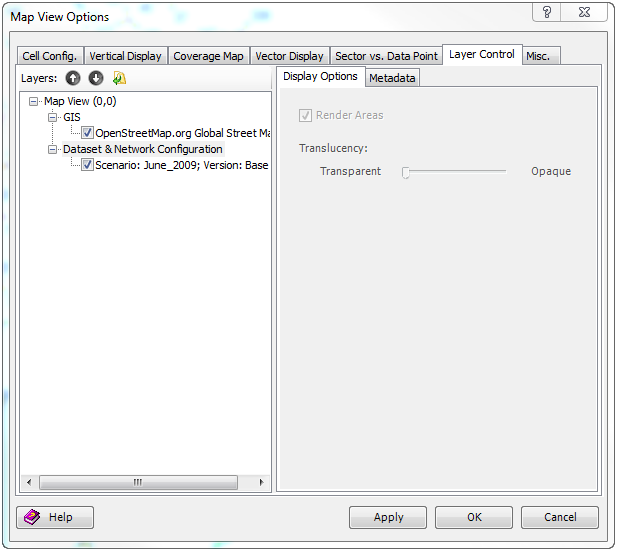
Layer Control tab, you can modify the Z-order of each layer and its opacity. However, vector layers will always be on the top of raster image layers.
Hide or Remove Map
When importing GIS data, multiple maps can be compressed into a .ZIP package and imported. The package can then be displayed in the Map View and each map in the package will be rendered as a separate layer. All of the layers will be blended and displayed. TEMS Discovery provides the function to hide or remove any single layer from the display by using the
Control Layer tab in the
Map View Options dialog. You can also remove a layer or a map package from the display by right-clicking and selecting
Remove Map Layers or Remove Map Packages from the context menu.
UDR
UDR can be applied to
filter metric data. You can only create, edit, or delete UDR in the Map View by utilizing the tools provided in the toolbar (
,

, and

), combined with the pop-up menu described above. See
Map View Toolbar for how to use these toolbar buttons to draw UDRs, edit UDRs, and pick area features from a vector layer.
4.2.2.5 Cell Radius Analysis
To enter cell radius analysis mode, click the
Cell Radius Analysis button

on the toolbar.
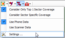
From the dropdown context menu, you can choose to consider only the Top 1 sector coverage, or to consider coverage for a specific sector (where-seen coverage).
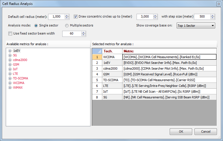
Select the Settings option to bring up the Cell Radius Analysis configuration dialog, where you can define what to analyze and how it is to be displayed.
To define metrics for analysis for different technologies, you can drag-and-drop any available metric from the tree view on the left to the spreadsheet on the right. Those defined metrics will be displayed in the Map View if the corresponding sector with the same technology is selected.
Once you click a sector on the Map View, the following indicators will be displayed (the entire display can be turned on or off from
Legend View). Sector selection list will pop-up in case multiple co-located sectors are present.
• A red circle. If you have defined the cell radius for this sector (see the
Cell Configuration Editor for how to add a new cell radius parameter and assign a value for each sector), that cell radius will be used. Otherwise, the default cell radius defined in the configuration dialog will be used to draw this circle.
• Concentric circles. Circles with the step size defined in the Cell Radius Analysis configuration dialog will be drawn as distance indicators.
• A blue pie. This pie will reach to the edge of the outermost red circle and indicate the azimuth and beamwidth of the sector.
• Drive test data in the sector's coverage area. If you elect to consider only Top 1 coverage, only drive test data in the area where that selected sector is the top 1 server will be displayed. On the other hand, if you elect to consider sector specific coverage, all drive test data in the area covered by that selected sector will be displayed.
A reference drive test data source is required for performing cell radius analysis. If any dataset is displayed in the Map View, data from the same device will be used for analysis. Otherwise, you can simply drag-and-drop any metric from the desired device in the Data Explorer to the Map View to define the reference data source.
4.2.2.6 Terrain Profile
The Terrain Path Profile view can be shown or hidden by clicking the

button on the toolbar. Using loaded elevation data and performing line-of-sight calculations along the defined path, you can also create a vertical profile along a user-specified path.
To define the path that the 3D path profile will be generated along, left-click and hold the position where you want to start the path, and move the cursor to the next position that you want to include in the path profile. The path profile for the defined path will be displayed as shown below. The red path indicates the line-of-sight. Any points along the path without elevation data underneath will be treated as a point with an elevation of zero.
The Terrain Path Profile view--creating a path for the 3D path profile.
The Profile Options tab allows you to change the start and end positions. The viewable height can also be adjusted by manually entering the desired height.
The LOS Options tab allows you to define the height of the starting position, which is represented by a vertical dotted line on the left side of the profile window. You also have the option of whether to consider the earth's curve and the atmospheric correction.
First Fresnel Zone (FFZ) is constructed along path profile using RF Frequency populated under LOS Options tab. FFZ Relative Blockage (%) is calculated as (RFFZ - CLOS)/RFFZ*100, with parameters referred in the picture below. RFFZ is FFZ radius at the location of most prominent obstruction. CLOS is LOS (line of sight) clearance relative to the obstruction.
FFZ Relative Blockage is accompanied with FFZ Clearance reported in meters. By convention, the text will be colored red when FFZ Relative Blockage is above 40% (obstruction loss greater than 6dB).
4.2.2.7 Reposition Waypoints
This feature is designed to reposition the indoor project's waypoints in case their positions are not accurately generated by a hand-held device.
Use the Reposition Waypoints feature as follows:
1. Open the indoor project for which you want to reposition waypoints.
2. Open the tree node of the GPS Position of the mobile you want to reposition.
3. Right-click on the Route metric under GPS Position and select Reposition Waypoints from the context menu. A window similar to the one below will be displayed.
4. Use the Reposition tool
to drag the waypoint you want to reposition to the location you want.
5. Repeat step 4 for all the waypoints you want to reposition.
6. Save the results by either right-clicking on the floor print and selecting Save from the content menu or closing the Map View and confirming the Save operation.
Note: Reposition Waypoints feature is only applicable to unrectified indoor log files as geo-coded indoor files already have location information converted to lat/long format.
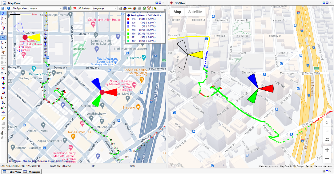
4.2.2.8 3D Map View
3D View allows for DT data visualization against Google 3D map information. 3D View was made as an addition of standard 2D Map View with synchronized metric/event and cell configuration content between the views. 3D View is supported for single 2D Map View in Outdoor mode only. 3D View includes pan, zoom, rotate and tilt change commands.
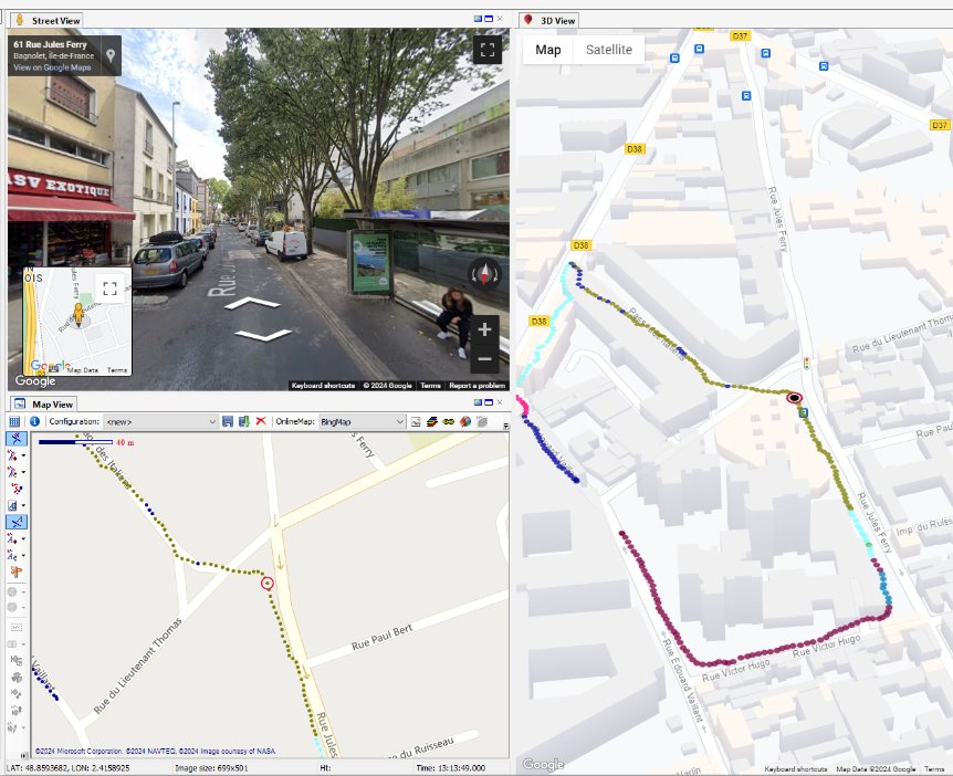
4.2.2.9 Street View
Street View populates standard Google Street View visualization which can be used as an additional context for drive test analysis. Street View was made as an addition of standard 2D Map View akin to 3D View. Street View is supported for single 2D Map View in Outdoor mode only. Data point selection change in 2D Map View or any other system view will automatically update viewer's location in 'Street View'. Standard Google Street View pan, zoom in/zoom out, rotate and location change controls supported.
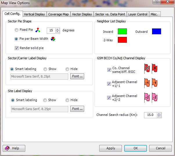
4.2.2.10 Layer/View Options
Display the Map View Options dialog by clicking the
Layer/View Options button
on the Map toolbar.
The view options are presented on separate tabs. They include:
Cell Configuration Display Options
The
Cell Configuration tab, along with the
Cell Configuration View Options dialog, allow you to modify the appearance of the cells displayed on the
Map View.
Sector Pie Shape. There are two options for displaying a sector: fixed pie with user-defined width and pie with width per antenna beamwidth.
Sector/Carrier Label Display. The Sector/Carrier Label will always be visible if the Show option is selected. To hide the Site Label, select Hide. The Smart labeling option allows the application to display site labels only if the site label does not overlap any other labels within the defined bounding rectangle.
The font for the label can be modified by clicking Font and selecting it from the dialog.
Site Label Display. The Site Label will always be visible if the Show option is selected. To hide the Site Label, select Hide. The Smart labeling option allows the application to display site labels only if the site label does not overlap any other labels within the defined bounding rectangle.
The font for the label can be modified by clicking Font and selecting it from the dialog.
Neighbor List Display. If you select the
Neighbor List IntelliSense Tool (
) or
Pick Serving Sector Tool (
), when the cursor is passed over sectors, the ray lines linking the serving sector to its neighbors will be displayed in different colors. The color of the lines, which can be modified here, indicates the relationship between the serving sector and its neighbor.
GSM BCCH Co/Adj Channel Display
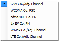
GSM Co/Adj channels can be indicated in the Map View with flags. You can choose to indicate only the sectors with same channel but different BSICs, +1/-1 adjacent channels, +2/-2 adjacent channels, or all of these channels.
Channel Search Radius (Km)
Use the spin control to define the channel search area for the selected sector.
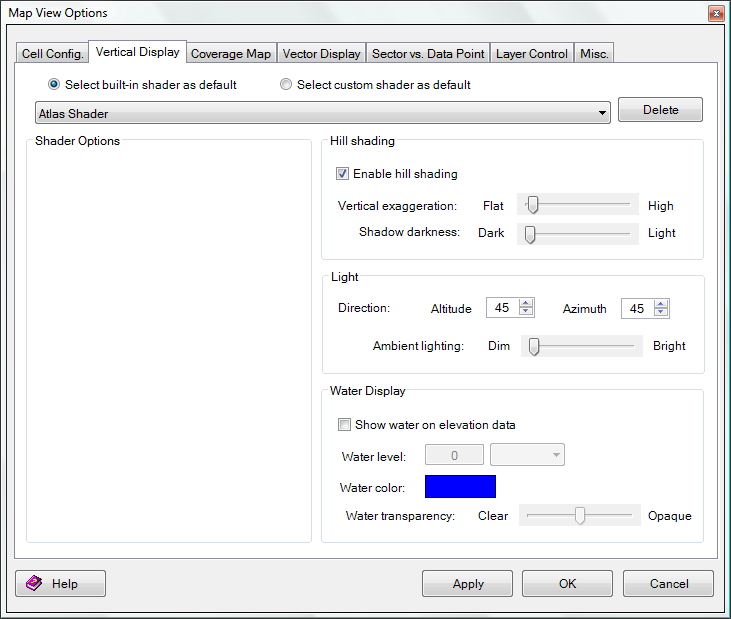
Vertical Display Options
The Vertical Display options allow you to control how terrain elevation data is displayed. The configurations can be adjusted to suit your needs. If you want to change colors, simply click on the color swatch to change it.
Shader Options. To view terrain elevation data, you can choose several algorithms from the dropdown menu to color and shade the loaded elevation data. Selecting the Select built-in shader as default radio button will allow you to choose from the following algorithms:
• Atlas Shader. The Atlas Shader is the default shader, and generally provides good results for any loaded elevation data.
• Color Ramp Shader. The Color Ramp Shader displays ramps of color: blue for low elevations to red for the highest elevations.
• Daylight Shader. The Daylight Shader colors all elevations the same shade and is only useful while Hill Shading is enabled.
When using this shader, you may customize the following options:
− Surface Color: sets the calculated surface intensity color.
• Global Shader. The Global Shader shades elevation datasets that cover large areas of the Earth such as Terrain Base and GTOPO30, to provide stunning results for these datasets.
• Gradient Shader. The Gradient Shader moderates coloring with elevation between the low elevations and the high elevations.
The actual colors ramped between can be selected in the Shader Options panel:
− Low Color: Sets the lowest elevation value color.
− High Color: Sets the lowest elevation range color.
• HSV Shader. The HSV Shader maps the elevations onto the HSV (hue saturation value) color space.
Mapping can be configured in the Shader Options panel:
− Low Color Start (Advanced): Sets where the lowest elevation will be on the HSV color range.
− Value (Advanced): Modifies the HSV value parameter.
− Saturation (Advanced): Modifies the HSV saturation parameter.
− Range: Modifies how much of the full HSV range is to be used--increasing this value leads to color wraparound.
− Reverse Colors: Reverses the orders of colors used for shading.
• Slope Shader. The Slope Shader colors loaded terrain data by the slope of the terrain rather than the absolute elevation. This shader allows you to identify the portions of the terrain that are relatively flat versus those that are relatively steep.
The definitions of "flat" and "steep" are the configurations for the Shader Options panel:
− Minimum Slope -> Slope Value: Allows you to set the slope at or below whichever Minimum Slope Color is used.
− Minimum Slope -> Color: Specifies the color with which all parts of the terrain with a slope at or below the Minimum Slope Value will be shaded.
− Maximum Slope -> Slope Value: Allows you to set the slope at or above whichever Maximum Slope Color is used.
− Maximum Slope -> Color: Specifies the color with which all parts of the terrain with a slope at or above the Maximum Slope Value will be shaded.
− Smooth Gradient: Specifies that all portions of the terrain with a slope between the Minimum Slope Value and the Maximum Slope Value will be colored with a smooth gradient of colors that vary with the slope from the Minimum Slope Color to the Maximum Slope Color.
− Custom Color: Specifies that all portions of the terrain with a slope between the Minimum Slope Value and the Maximum Slope Value will be colored with a single color that can be modified with the Select button.
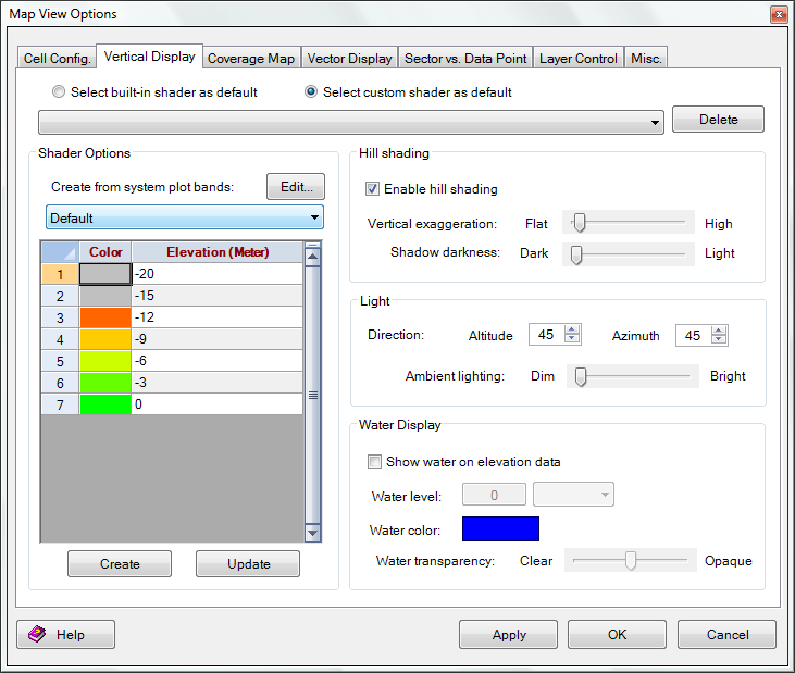
Alternatively, you can choose to use custom shading created from system plot bands.
Hill Shading. Select the Enable Hill Shading option to view elevation data as a shaded relief. With the option on, shadows will be generated using the loaded elevation data along with the remaining settings on this panel. The Vertical Exaggeration setting is used to control the exaggeration of relief features.
When this option is turned off, the map will appear flat, with elevations distinguished only by color. Selecting the Select custom shader as default radio button will open Shader Options similar to those shown in the dialog below:
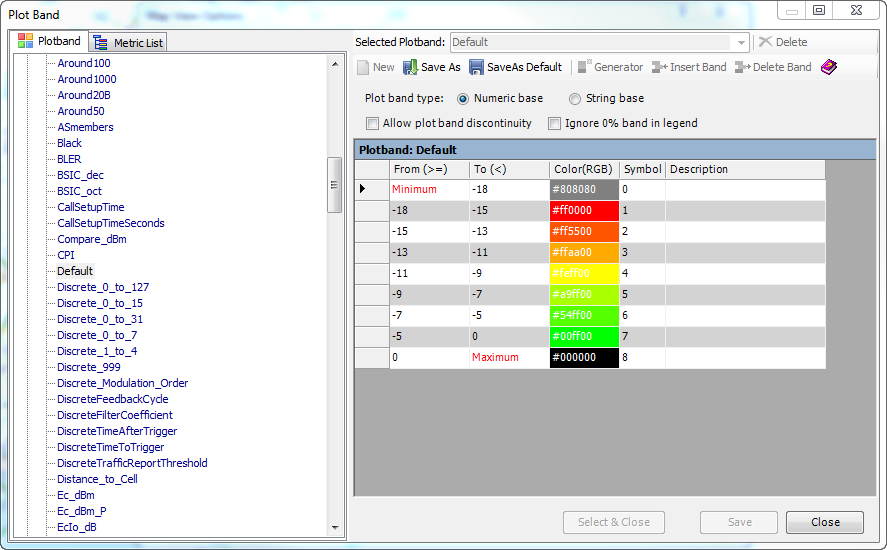
When using this option, select a plot band from the dropdown menu, and the current configurations for that plot band will appear in the frame below. To change the configurations, click Edit and the following window will appear:
Light. The Lighting Direction option sets the position of the light source (the "sun") for hill shading. Note that cartographic azimuth and altitude are used. 0 azimuth means the sun is to the north, 90 azimuth means the sun is to the east, etc. An altitude of 90 means that the sun is directly overhead, while an altitude of 0 means the sun is on the horizon.
Use the Ambient Lighting option to brighten up dark datasets or to dim bright datasets.
Water Display. The Water Level setting controls the level at which water is displayed. The default is set at an elevation of 0 meters above sea level. Use this to simulate different flood and sea level change scenarios.
The Water Transparency setting controls the clarity of the water displayed if configured to show water. Clearer water allows more underlying reliefs to show through, while opaque water allows none.
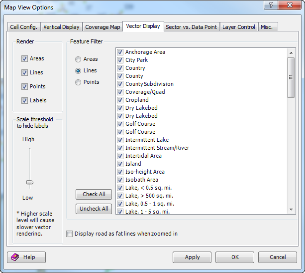
Vector Display Options
The Vector Display options let you control the display of vector data (areas, lines, and points).
Render. This section contains the settings for which types of vector features (areas, lines, points, or labels) will be displayed when loaded. You can use these settings to turn off an entire class of features all at once. For a finer degree of control, see the Feature Filter section described below.
Scale threshold to hide labels. This setting controls how much de-cluttering of displayed vector data is done. This is useful when you have a large of amount of vector data loaded. For example, if you have all of the roads for an entire state loaded at once, you can slide the detail slider to hide minor roads until you have zoomed in sufficiently on the data. The default setting (Low) will display all vector data regardless of zoom scale. This setting does not affect the display of raster or elevation datasets.
Feature Filter. This section allows you to select which specific area, line, and point feature types to display. By default, all feature types are displayed.
Display road as fat lines when zoomed in. When zoomed into the display, the road defaults to a constant very thin line. Select this option to display the road in a heavy line to make it easier to see.
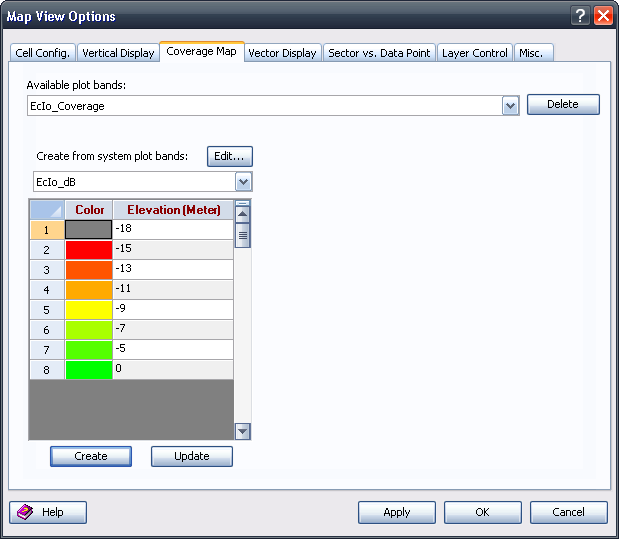
Coverage Map Display Options
• The Coverage Map is displayed in the same way as terrain elevation data. The method to define a plot band for a coverage map is the same as defining a plot band for terrain elevation data. Please see
Vertical Display options for more information.
Sector vs. Data Point Display Options
If you select the
Spider Movement Tool (
), when the cursor is passed over a sector, ray lines linking the data point to its serving sector will be displayed in different colors. The color of ray lines can be customized using Sector vs. Data Point display options.
Layer Control Display Options
Multiple layers of data can be displayed in the
Map View with certain composite modes. For GIS data, by default, all vector data is drawn after any other loaded raster or elevation data, regardless of the order of the vector layers in this dialog.
Layers Tree View. In the Layers tree view on the left, the higher level indicates the view index in multiple Map Views; the lower level lists all loaded GIS, dataset, and network configuration layers in that view. You can select a layer by clicking on its name. For the GIS layer, its current Display Options and Metadata are displayed in the tab controls on the right side.
To hide a layer, uncheck the layer by clearing the checkbox before its name in the tree view, or click the
Close Selected Layer 
button on the toolbar to unload that layer from the
Map View.
To change the drawing order of a selected layer, use the
and
buttons to move the layer up and down. The first layer in the tree view will be drawn on top of the other layers.
Display Options. The Display Options tab contains controls for the color intensity (brightness, darkness), color transparency, blending, anti-aliasing, and texture mapping of the selected layers. Note that the exact options displayed depend on the type of data.
• The Color Intensity setting controls whether the displayed pixels are lightened or darkened before being displayed. It may be useful to lighten or darken raster overlays to see overlaying vector data more clearly.
• The Translucency setting controls the degree that you can see through the layer underneath the selected layer. The default setting Opaque means that you cannot see through the overlay at all. Settings closer to Transparent let you see through the overlay and blend overlapping data.
• Selecting Transparent will make a particular color transparent, making it possible to see through a layer to the layers underneath. For example, when viewing a DRG on top of a DOQ, making the white in the DRG transparent makes it possible to see much of the DOQ underneath. Clicking Set Transparent Color allows you to select the color that will be transparent in the selected overlay(s) as well as save the palette for palette-based files to a color palette (.pal) file.
• Interpolate removes jagged edges by making a subtle transition between pixels. Turning off this option maintains the hard edges of the pixels as they are rasterized.
• Selecting Texture Map will drape a 2D raster overlay over loaded 3D elevation overlays. Turning on Texture Map will let the overlay use any available data from the underlying elevation layers to determine how to color the DRG or DOQ; the result is a shaded relief map.
• Selecting Auto-Clip Collar automatically removes the collar from loaded raster data. It is typically used to remove the white border around a DRG or the small black collar around a 3.75 minute DOQQ. This allows you to seamlessly view a collection of adjacent DRG or DOQ files.
• Selecting Automatically adjust contrast will automatically adjust the display contrast.
Metadata. The Metadata tab displays metadata for the selected layer.
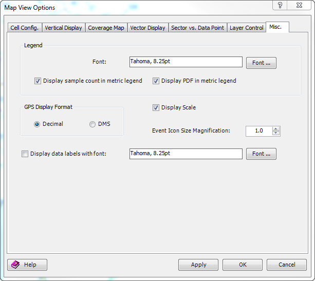
Miscellaneous Display Options
The Misc. tab provides options for controlling the display of the legend and GIS elements.
Legend
• Modify the legend font.
• Control the legend contents:
− Turn the sample count display on/off.
− Turn the % distribution display on/off.
GPS Display Format
• Select the display format of GPS coordinates – decimal or DMS
• Toggle the display of the map scale on/off.
• Define the size of event icons.
• Display data labels, and select the font size for the labels.
1.1.1.1 Create Output
Right-clicking the screen will bring up a pop-up menu that offers the following options for output display.
Copy
Copies the current display in screen resolution to the Clipboard; once it has been copied, it can be pasted outside of TEMS Discovery.
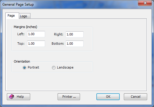
Page Setup
Page Setup is used to modify the page settings for printout or PDF generation. The Printer button brings up the standard printer setting dialog.
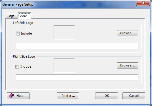
The Page Setup dialog contains two tabs: Page and Logo.
• Page tab. The options on the Page tab allow you to define the margins and orientation of the printed document. The orientation can be either portrait or landscape.
• Logo tab. The options on the Logo tab allow you to add one or two logos or other images to the output. The image(s) will be placed at the top of the paper. The position of the image can be aligned at the left or right.
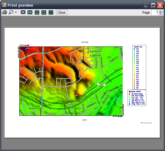
Print / Generate PDF
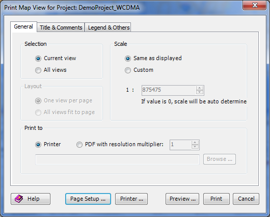
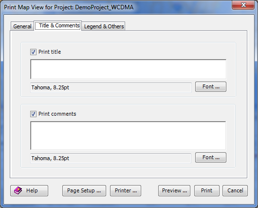
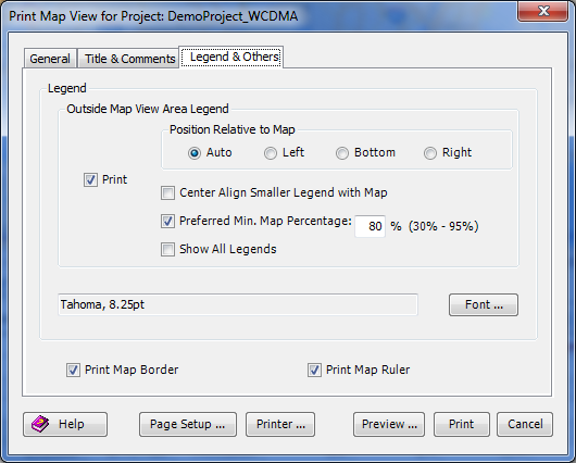
The Print dialog will appear when Print is selected from a right-click context menu. The Print dialog includes:
• Three tabs: General, Title & Comments, and Legend. These tabs are described below.
• Several action buttons:
− Help. Accesses the on-line help for the Print function.
− Page Setup. Accesses the page setup dialog. See
Page Setup for more information.
− Printer. Accesses your system’s standard printer dialog.
− Print. Sends the output to the default printer.
− Preview. Accesses a Print Preview dialog that shows how the printout will look.
− Cancel. Cancels the print command.
General tab
The General tab has the following panels:
• Selection. Select Current View to print the view that was right-clicked.
Select All Views to print all the views that are displayed.
• Layout. If you choose All Views from the Selection panel, you can also choose how to print the views: One view per page or All views fit to page.
• Scale. You can define a scale or apply a scale for the printed views.
• Print to. The output can be sent to a printer or a PDF file. If selecting the PDF option, you can define the resolution multiplier (the resolution of the PDF file will be the screen resolution multiplied by the resolution multiplier) and the target file name.
Title & Comments tab. You can include a title at the top, or comments at the bottom of the output.
Legend tab. You can choose whether to include the Legend in the output. If selected, the Legend can be placed at the left, bottom, or right of the paper. You can also print a map border and include a map ruler.
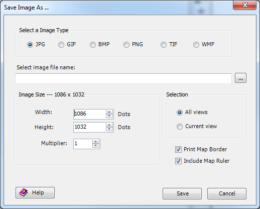
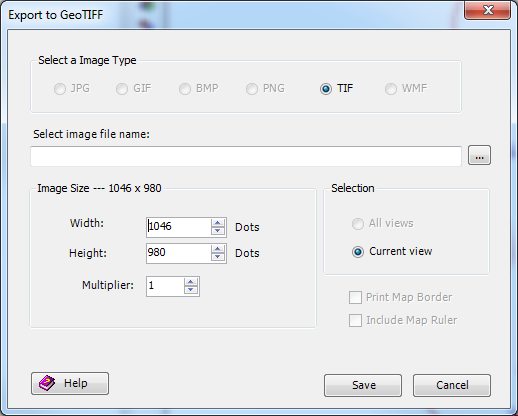
Generate Image File
You can capture the
Map View display as a JPEG, GIF, BMP, PNG, TIF or WMF file. The generated image can be generated at a higher resolution than the screen to provide greater fidelity.
The width and height of the generated image in pixels are specified in the Image Size panel. By default, the Map View size is used. Using these values will generate an image that is an exact copy of what you see. You can change these values to generate a higher or lower resolution image with the obvious trade-off of size versus quality. You can also define the multiplier, which will be applied to the width/height defined in the panel.
Export to GeoTIFF File
GeoTIFF - TIFF is a lossless format that is supported by many GIS packages. Saving the screen as a TIFF generates a 24-bit uncompressed TIFF. Additionally, all geo-referencing data is stored in a GeoTIFF header attached to the TIFF, making the image completely self-explanatory.
Export Current View to GIS Package
You can select this context menu to export the currently displayed GIS data in the Map View to a GIS package. All the information including vector, raster, and elevation data will be preserved and can be imported back to TEMS Discovery. The generated GIS package will use .gmp as the file extension. This function can be useful for cropping or merging GIS data for achieving or sharing.
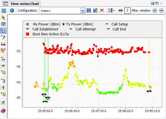
1.1.2 Time Chart

The Time Chart displays metric data in a time serial. To display data in the Time Chart, drag-and-drop the metric data object from the Data Explorer into the Time Chart, or right-click the metric data object and choose
Send to Time Chart from the pop-up menu.
Click any data point to display the detail information in the tooltip.
1.1.2.1 Time Chart Pop-up Menu
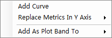
The following pop-up menu will appear if metric data is dragged-and-dropped into the Time Chart:
| Add Curve. Place the metric on the Time Chart, where it will coexist with existing data. Replace Metric In Y Axis. Replace an existing metric in the Y-axis. Add As Plot Band To. Associate the dragged metric data to a particular curve displayed. The color of the data point in that curve will be determined by the plot band of the metric data. |
1.1.2.2 Time Chart Toolbar
| Table Size Display the Table Size selector for creating multiple Time Charts. The Time Charts are always in sync. |
Combo box | List the available configurations. Each configuration defines the collection of metrics to be loaded and in which chart to load them. When sending/dragging a file/device to the Time Chart with a configuration selected, the currently defined data filtering options will be applied. |
| Save Configuration. Save the currently displayed metric and its location as a configuration. |
| Save Configuration As. Save the current metric configuration as a new configuration. |
| Delete Selected Configuration. |
| Cleanup. Clean up the display. |
| View Option Shortcuts: • Show top legend • Show symbol • Show connection line • Always connect points • Show event vertical lines |
| Zoom to Window Size. Define a time window for display. Click to adjust the current time window to the defined window. |
| Previous Time Window. Move the window to the previous time window. |
| Next Time Window. Move the window to the next time window. |
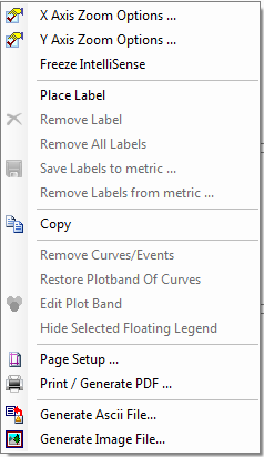
| Pointer. Change mouse cursor to a pointer. Right clicking the screen will bring up the pop-up menu shown below. | **X Axis Zoom Options… **Y Axis Zoom Options… Freeze IntelliSense. Freeze the IntelliSense display - a vertical red line indicating the time and the value of the metric in the Legend View. Place Label. Place text labels next to the Time Chart. Remove Label. To remove a label, select the label and choose this option. Remove All Labels. Remove all labels displayed in the Time Chart. Save Labels to Metric. Save the labels in the Time Chart and associate them to a metric. Remove Labels from metric. Detach labels from the metric. Copy. Copy the current display to the Clipboard so it can be pasted it outside of TEMS Discovery. Remove Curves/Events. Remove one or all curves/events from the display. | Restore Plot Band of Curves. Metric data can be associated to a curve as a plot band; in other words, the color of a data point in that curve will be determined by the plot band of the metric data. Restore Plot Band of Curves will remove this association. Edit Plot Band. Edit the plot band of a curve. Hide Selected Floating Legend. The plot band of a curve can be displayed graphically as a floating legend. Select this option to hide the display of the selected floating legend. Page Setup. Page setup for printout or PDF generation. Print / Generate PDF. See Create Output. Generate ASCII File. Export the metric data to an ASCII file. Each metric will be exported as a column in the file. Generate Image File. See Generate Image File for more information. |
|
| View Option. Open the Time Chart View Options dialog. |
| Data Point Icon Size: 1. Left-click to enlarge the icon size of a data point. 2. Right-click to reduce the icon size of a data point. |
| Show/Hide Legend. Show or hide the Legend. This button will be enabled if you have added a metric to the chart as a plot band to an existing metric. |
| X Axis Zoom: 1. Left-click and hold to draw a rectangle that will zoom in the X-axis to that area. 2. Right-click and hold to draw a rectangle that will zoom out the X-axis to that area. |
| Reset X Axis. Reset the X-axis to display all data. |
| X Axis Pan. Pan the Time Chart in the X-axis. |
| Y Axis Zoom: 1. Left-click and hold to draw a rectangle that will zoom in the Y-axis to that area. 2. Right-click and hold to draw a rectangle that will zoom out the Y-axis to that area. |
| Reset Y Axis. Reset the Y-axis to display all data. |
| Y Axis Pan. Pan the Time Chart in the Y-axis. |
| Unzoom. Undo the last zoom action. To clear the history of previous zoom actions, click the Reset button. |
| Help. |
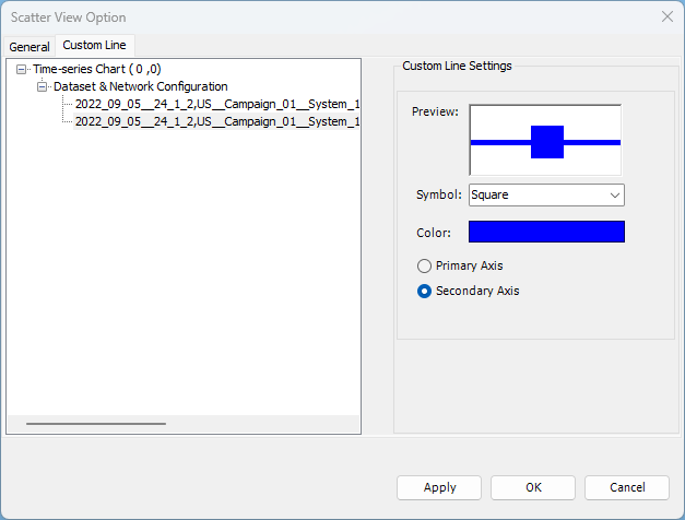
1.1.2.3 Time Chart View Options
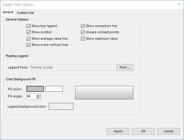
Time Chart View Options allows user to modify a number of visualization settings under General tab including (1) whether the top legend is displayed, (2) whether to draw connection line between measurement points, (3) whether to display measurement point symbol, (4) whether to always (idle periods included) connect measurement points, (5) whether to display average measurement value line, (6) whether to display maximum measurement value and (7) whether to show vertical supporting lines when events are included in the chart.
Furthermore, ‘Custom Line’ tab settings allow users to customize metric symbol type and color and change Y-axis assignment.
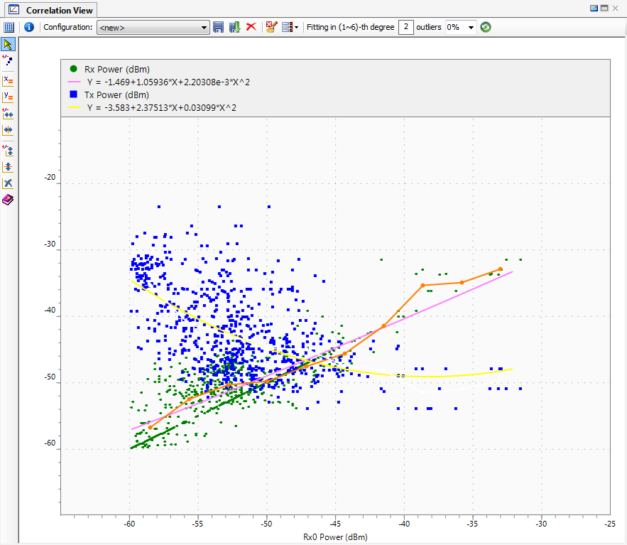
1.1.3 Metric Correlation

Metric Correlation enables the indication of the linear/non-linear relationship between two metrics. You can drag-and-drop a metric data object from the
Data Explorer into the Correlation View, then drag-and-drop another metric data object from the Data Explorer into the Correlation View. Choose
Replace Metric in X Axis to build the relationship between these two metrics. The Least Squares Fitting mathematical procedure is applied to build this correlation.
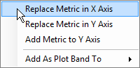
The following pop-up menu will appear if metric data is dragged-and-dropped into the Correlation View:
| Replace Metric in X Axis. Replace the metric in the X-axis with the dragged metric. Replace Metric In Y Axis. Replace the metric in the Y-axis with the dragged metric. |
Add Metric to Y Axis. Add the dragged metric to the Y-axis. This will create a new fitting curve that indicates the relationship between this metric and the metric in the X-axis. Add As Plot Band To. Associate the dragged metric data to a particular curve displayed. The color of the data point in that curve will be determined by the plot band of the metric data. |
1.1.3.1 Correlation View Toolbar
| Table Size. Display a Table Size selector for creating multiple Correlation Charts. The Correlation Charts are always in sync. |
Combo box | List the available configurations. Each configuration defines the collection of metrics to be loaded and in which metric correlation to load them. |
| Save Configuration. Save the current metric configuration |
| Save Configuration As. Save the current metric configuration as a new configuration. |
| Delete Selected Configuration. Delete the current metric configuration. |
| Cleanup. Clean up the display. |
| View Option Shortcuts: • Show scatter points • Show fitting curve • Show aggregation curve |
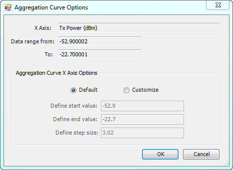
| Apply Fitting Order. You can define a degree from 1 to 6 for Least Squares Fitting.
Click this button to apply the change. |
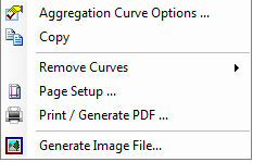
| Pointer. Change the cursor to a pointer. Right-clicking the screen will bring up the following pop-up menu: | | Aggregation Curve Options. Open the Aggregation Curve Options dialog. This dialog allows the user to define how the aggregation curve is to be created. You can define the start value, end value, and step size. | | Copy. Copy the current display to the Clipboard to paste it outside of TEMS Discovery. Remove Curves. Remove one or all curves from the display. Page Setup. Page setup for printout or PDF generation. Generate Image File. See Generate Image File for more information. |
|
| Data Point Icon Size: • Left-click to enlarge the icon size of a data point. • Right-click to reduce the icon size of a data point. | |
| Unify X Axis Scale of All Charts. Make all charts have the same X-axis scale. | |
| Unify Y Axis Scale of All Charts. Make all charts have the same Y-axis scale. | |
| X Axis Zoom: • Left-click and hold to draw a rectangle that will zoom in the X-axis to that area. • Right-click and hold to draw a rectangle that will zoom out the X-axis to that area. | |
| Reset X Axis. Reset the X-axis to display all data. | |
| Y Axis Zoom: • Left-click and hold to draw a rectangle that will zoom in the Y-axis to that area. • Right-click and hold to draw a rectangle that will zoom out the Y-axis to that area. | |
| Reset Y Axis. Reset the Y-axis to display all data. | |
| Unzoom. Undo the last zoom action. To clear the history of previous zoom actions, click the Reset button. | |
| Help. |
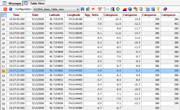
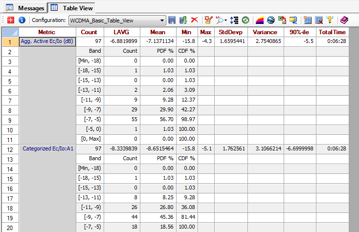
1.1.4 Table View

Table View provides a tabular display of multiple metrics. Multiple Table Views can be created.
In Table View, you can either click the scroll bar or press arrow keys to move the display up and down. If you click a cell to make it active and then use the arrow key to move the display up and down, TEMS Discovery will skip the blank cells and jump right to the previous/next valid cell.
If you set the option
Generate statistic data along with Table View to true in
Options, the statistic report of the metric will displayed in addition to measurement data.
Table View Toolbar
| Create New Table View |
Combo box | List the available configurations. Each configuration defines the collection of metrics to be loaded and in which spreadsheet to load them. When sending/dragging a file/device to Table View with a configuration selected, the currently defined data filtering options will be applied. |
| Save Configuration. Save the currently displayed metric and its location as a configuration. |
| Save Configuration As. Save the current metric configuration as a new configuration. |
| Delete Configuration. Delete the current configuration. |
| Cleanup Table View. Clean up the display. |
| Zoom Spreadsheet. Zoom in or out of the spreadsheet. |
| Enable/disable Auto Adjustment of Column Height. |
| Export to MapInfo MIF/MID. Export the displayed metric data to MapInfo Mif/Mid files. |
| Export to Google Earth KMZ file. ** |
| Save to Excel. Export the displayed metric data to an Excel file. Note: Only up to 65536 records can be written to the Excel file due to Excel's limitations. |
| Export to Text Delimited Files in ZIP Package. Export the displayed metric data to ASCII files and then compress all the files to a ZIP file. |
| Add Sheet. Add a new spreadsheet to the Table View. |
| Remove Current Sheet. Remove the current active spreadsheet and its partner (Metric and Statistic spreadsheets). |
| Remove Columns. Delete the selected column and its corresponding statistic data from the spreadsheet. |
| Help. |
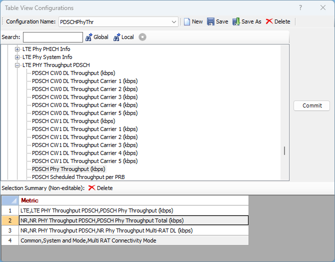
Configuration | Table View Configuration option allows users to modify existing or create new Table View configurations. Users may select metrics and events to add them to configuration via Commit button. Metric/event order can be changed after addition by drag-and-drop method applied to Selection summary row number. Existing configuration may be selected from configuration drop down list for editing purposes.
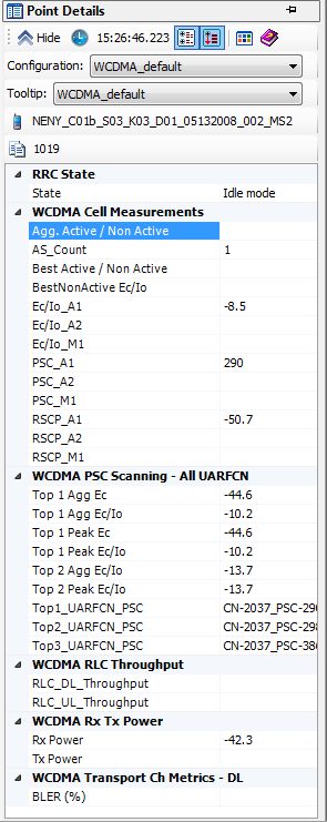
1.1.5 Point Detail View

The Point Detail View provides a convenient way to overview detail information from a particular time or location. By moving the cursor into the
Map View and
Time Chart, or by changing the row selection in the spreadsheets of the
Messages View or the
Table View, the detail information will be displayed in the spreadsheet as shown below.
In this dialog, you can also select a tooltip configuration, so that the corresponding detail information can be displayed in the tooltip.
You can control what information to display in this view by selecting a different metric group from the combo box. Clicking the
Point Detail Configuration button

on the toolbar will bring up the
Point Detail Settings dialog, where you can create or edit the metric group.
Clicking the
Sort button

on the toolbar will sort the metric group by category (otherwise, the metric group is sorted alphabetically).
If the metric group is sorted by category, clicking the
Grid Expand/Collapse button

on the toolbar will expand or collapse all of the categories.
1.1.6 Image View
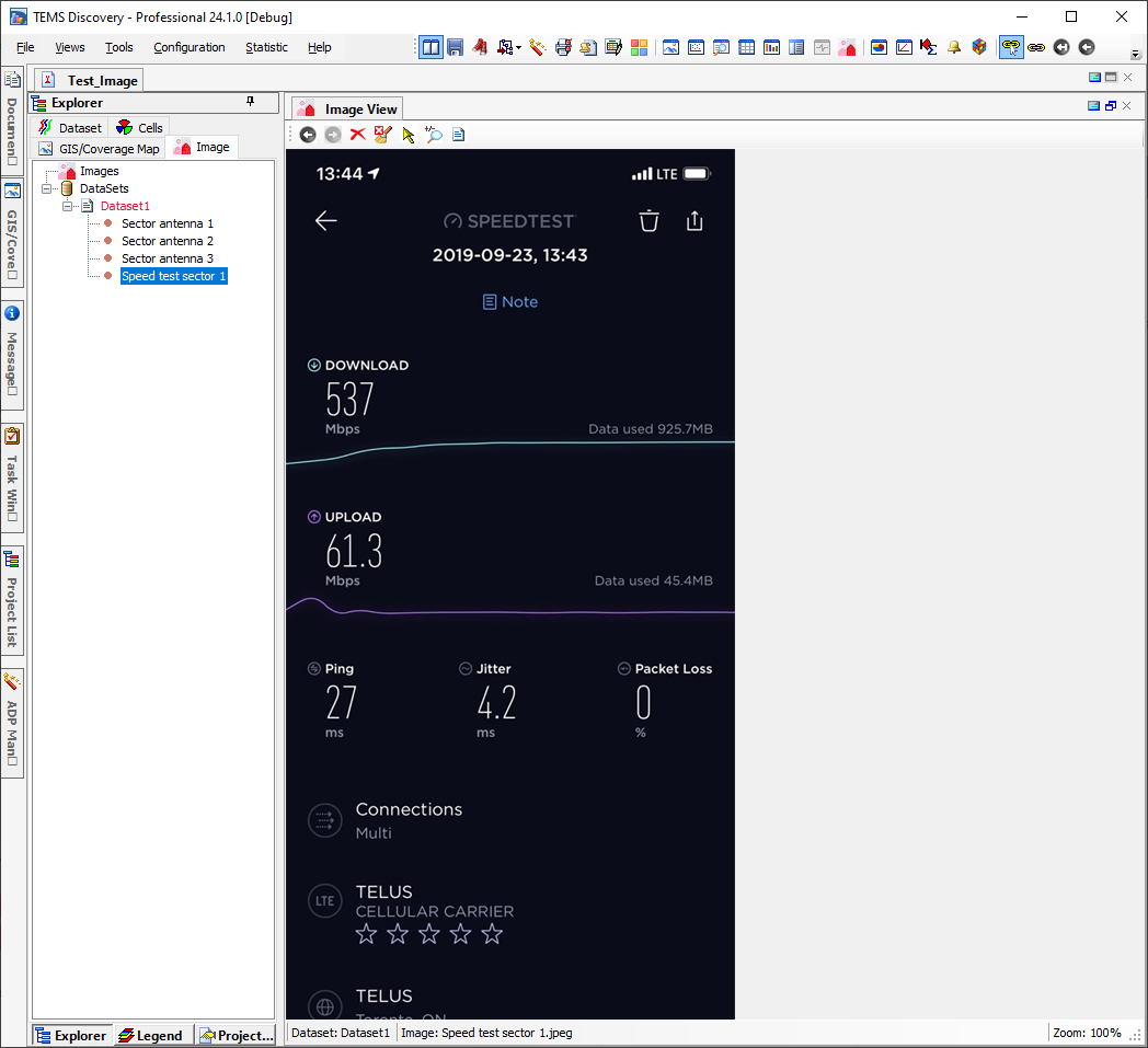
• The Image View allows users to display images imported to selected project.
Image View Toolbar
| Previous Image. Display previous image. Disabled if first image is selected. |
| Next Image. Display next image. Disabled if last image is selected. |
| Cleanup Image View. Clean up the display. |
| Pointer. Change the cursor to a pointer. |
| Zoom Image. Zoom in (left mouse click) or out (right mouse click) of the image. |
| Copy Image. Copy image to the Windows clipboard. |
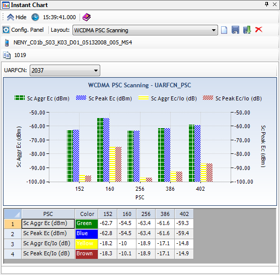
1.1.7 Instant Chart

The Instant Chart View provides a convenient way to view the instant information of the selected metrics with respect to a group-by key metric (e.g., UARFCN-PSC) from a particular time or location. By moving the cursor into the
Map View or
Time Chart, or by changing the row selection in the spreadsheets of the
Messages View or the
Table View, the detailed metric information will be displayed as shown below, both in a chart and in a spreadsheet.
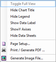
Right-clicking the chart area will bring up a context menu like the one shown here. From this context menu, you can adjust how the Instant Chart will be displayed and output the display to printer, PDF or image file. | |
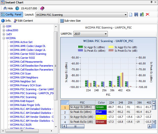
If you click the
Config Panel button

, you will change the window to the one shown below. Then, you can click the
Sub-view Size button
to create new layouts or edit existing layouts by dragging-and-dropping Instant Chart component content from the left panel to the right panel.
The
Edit Content button

is a shortcut that opens the
Instant Chart Component Content dialog for editing the selected component content on the left panel.
Instant Chart Toolbar
| Config Panel. Configure which sub view of the layout is using which Chart Configuration. |
Combo box | List the available Instant Chart layout configurations. |
| New. Create new layout configuration. |
| Save Configuration. Save the current layout configuration. |
| Save Configuration As. Save As the current layout configuration with another name. |
| Delete Selected Configuration. Delete the current layout configuration. |
| Help. |