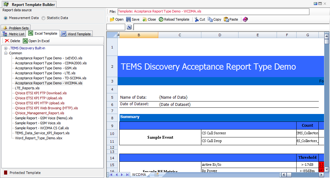
2.2 Report Template Builder – Measurement Data

The
Report Template Builder provides great flexibility when generating reports from drive test data. Reports can be generated in
several Excel formats.
The Report Template Builder eliminates the need to request customized report generation from another tool vendor, or to manually conduct data manipulation. Data objects need only to be dragged-and-dropped from the Specific Metrics tab to generate a final report.
For all of TEMS Discovery's supported metrics, prescriptives may be defined and the results presented in a chart with all Microsoft Office Excel supported types. With a single operation, it is possible to generate the final report from TEMS Discovery report templates.
The Report Template Builder has the following components:
• Toolbar and Context Menu
• Word Templates. Lists all Word type report templates defined by MS Word. See
Problem Summary View for more information.
• Problem Sets. Lists all problem sets defined by using the Report Template Builder. Problem set definition is similar to report template definition, except that the B1 cell in the spreadsheet is a flag to note whether the final report indicates that the device has problem. If the value in B1 cell is 0, the device has no problems; otherwise, the device does have problems. See
Problem Summary View for more information.
• Report Template Editor. For directly generating the final report or defining the report template. To edit the report format or color, it is recommended that you use Microsoft Office Excel.
2.2.1 Report Builder Toolbar and Pop-up Menu
| Open. Open an Excel file. |
| Save. Save the information in the spreadsheet as the final report or report template. |
| Close. Close any open file and clear the spreadsheet. |
| Reload Template. Reload the report template. |
| Cut. Cut the selected text in the spreadsheet. |
| Copy. Copy the selected text in the spreadsheet. |
| Paste. Paste text to the spreadsheet. |
| Help. |
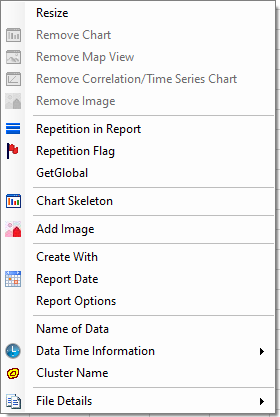
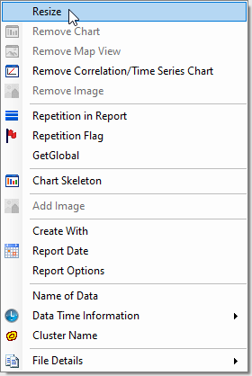
Report Template Builder Right-Click Menu
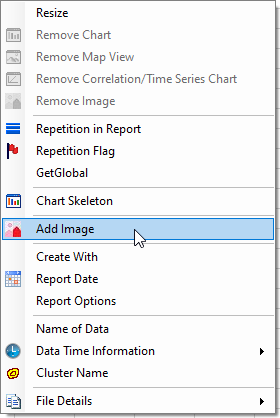
| Resize. Allows user to modify size of the existing Map View, Chart, Time Series Chart, Correlation Chart, Trend Chart, or Image report element. Remove Chart. Remove selected chart report element definition. Remove Map View. Remove selected Map View report element definition. Remove Correlation/Time Series Chart. Remove selected Correlation Chart or Time Series Chart report element definition. Remove Image. Remove selected Image report element definition. Repetition in Report. Define repetition options in the report template. See Options of Repetition in Report. Repetition Flag. Define a repetition flag in the cell as a placeholder. This placeholder will be replaced with the value of the repetition key when the report is generated. GetGlobal. Define GetGlobal flag in the cell as a placeholder. This placeholder will be replaced with the value that has been set by SetGlobal definition when the report is generated. As a rule, SetGlobal must be defined in the row after GetGlobal is defined. Chart Skeleton. Define a Chart Skeleton. Add Image. Add new Image report element definition. Create With. Place a tag for reporting the version of TEMS Discovery. |
Report Date. Place a tag for reporting the date when the report is generated. Report Options. Place a tag for reporting the report options. See Report Options. Name of Data. Place a tag for reporting the file name of data. Data Time Information | Date Of Dataset. Place a tag for reporting the date range of the dataset from which the report is generated. Data Time Information | Start Collection Time. Place a tag to report the start collection time of data. Data Time Information | End Collection Time. Place a tag to report the end collection time of data. Data Time Information | Collection Duration – hh:mm:ss. Place a tag to report the collection duration in the format of hours:minutes:seconds. Data Time Information | Collection Duration – minutes. Place a tag for reporting the collection duration in the format of minutes. Cluster Name. Place a tag to report the name of the cluster. File Details | File Detail (All). Place a series of tags to list file details of all data. File Details | File Detail – Device. Place tags to list the device description of each file in the data. File Details | File Detail – Name. Place tags to list the name of each file in the data. File Details | File Detail – Duration. Place tags to list the duration of each file in the data. File Details | File Detail – Gap. Place tags to list the time gap of each file in the data. File Details | File Detail – Start Time. Place tags to list the start time of each file in the data. File Details | File Detail – End Time. Place tags to list the end time of each file in the data. File Details | File Detail – <Device Attribute>. Place tags to list specific device attributes of each file in the data. |
2.2.2 File Formats and Limitations
The report template can be in any of the following Excel files types:
• Excel 97-2003 xls
• Excel 2007/2010 xlsx
• Excel 2007/2010 Macro-Enabled xlsm
Cross-referencing among different sheets is supported in each format, but VBA macros are supported only as follows:
• Excel 97-2003 xls report template. Can contain VBA macros, but the maximum worksheet size is 65536 rows by 256 columns.
• Excel 2007/2010 xlsx report template. Maximum worksheet size is 1048576 rows by 16384 columns. Cannot contain VBA macros.
• Excel 2007/2010 macro-enabled xlsm report template. Maximum worksheet size is 1048576 rows by 16384 columns. Can contain VBA macros.
However, the Report Template Builder cannot edit an Excel 2007/2010 Macro-Enabled xlsm file. You will need to open a report template (xls or xlsx) in Excel, add macros as needed, and then save the file as an Excel macro-Enabled xlsm file.
Limitations of Report Builder and report output:
• Cell comments and form controls (such as buttons, checkboxes, list boxes, etc.) will not be read from or written to .xlsx or .xlsm files.
• Reading and writing shapes from and to Open XML files is limited. Many properties may be lost, and all complex shapes will be lost.
• When reading conditional formats, only Excel 2003 features are supported. Conditional formats that use Excel 2007-2010 features are ignored (deleted).
Also, Report Builder does not support the new ability of Excel 2007-2010 to have different conditional formats that overlap. Therefore, when a conditional format is read that overlaps a previous conditional format, the cells in the previous conditional format will be removed from the newly read conditional format.
• Table references in formulas such as [Sales] are converted to #REF!
Report Builder does not support Excel tables. With no table to refer to, there is no way to preserve these formulas in their original state. Excel will generate a warning when reading the workbook.
Workaround to display image properly in report output:
• Open report template using Excel, remove the images from report template. You may see many images overlapping, which may be instroduced by third-party component TD uses.
• Create your image and save as BMP file, then select Excel menu “Insert->Picture” and insert your image to report template, then save.
• If you edit the report template and save the change in TD report builder, you will have to repeat the above steps.
2.2.3 Define Report Template
A TEMS Discovery report template is actually a
Microsoft Office Excel file with TEMS Discovery formatted information. TEMS Discovery can read and write Excel files and replace TEMS Discovery formatted information with the final values.
To define a report template, you can:
13. Open an external Excel file, open an existing internal report template, or work directly on the right-side spreadsheet called the Report Editor.
14. Drag-and-drop any IE from the Metric List tab into the Report Editor.
15. Pick the desired aggregate or charting function from the pop-up menu. As a result, a TEMS Discovery formatted string, along with additional information, will be placed into the target cell.
16. Save the report template through the
toolbar functionality. The saved report template will be listed in the Report Templates list box.
It is recommended that you create an Excel file to define the reporting format, including font, color, and formula and so on. Click the
Open button

on the toolbar to open the file and define the TEMS Discovery report template. Additionally, you can right-click on any report template in the list box and select
Open In Excel to further edit the report format.
More information about defining a report template:
• Drop data objects into the editor and select the report option (see
Report Options).
• To define generation of statistics data, see Define Statistic Data.
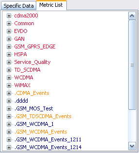
2.2.3.1 Metric List
All TEMS Discovery supported metrics and user-defined events and metrics are listed in the Metric List tree view. You can drag-and-drop any of the metrics (except for Layer 3 message information elements) into the Report Editor.
Note: If you need to define a report from a Layer 3 message IE, define an advanced metric by using the Script Builder and define the report using that advanced metric. See the
Script Builder for how to define an advanced metric.
When you drop an item into the Report Editor, the
Report Options dialog will pop up.
2.2.3.2 Report Options
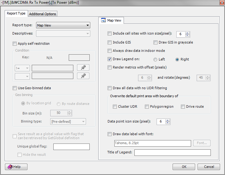
Once an information element is dropped into the Report Editor, the dialog shown below will pop up. You can select the desired report type and descriptive, and even apply a threshold or range to the data of target metric. Once you have selected the settings, a well-formatted string and additional information will be placed in the target cell.
Report Types
• Map View. Defines Map View report.
• Multi-dimension Statistic View. Defines Multi-dimension Statistics report.
• Name. Places the name of the dragged item into the target cell.
• Single Value. Differentiates between a Chart and a Statistic Data report. This type of report definition produces one final value.
• SetGlobal. Defines a global value (a single value or an array of value) generated from a metric's data. This global value can be retrieved by the GetGlobal flag. Be aware that SetGlobal must be defined after GetGlobalFlag in the report template. In other words, if the GetGlobal flag is defined in row number 10, the corresponding SetGlobal flag must be defined in a row number that is greater than 10.
• Statistic Data. Defines Statistic Data report. See Define Statistic Data.
• Trend Chart. Defines Trend Chart report. See Define Trend Chart for details.
Descriptives
• Count. Count of the data points.
• Duration. The time span of the first data collected to the last data collected.
• Linear Average. Linear average of the data points.
• Mean. Mean of the data points.
• Max. Maximum value of the data points.
• Min. Minimum value of the data points.
• Mode. Mode of the data points.
• Percentage. Percentage of the data points that are within the range defined or over/below a defined threshold. A threshold or a range must be defined if this report type is selected.
• Standard Deviation. Standard deviation of the data points.
• Sum. Summation of the value of the data points.
• Unique Count. Count of unique values of the data points.
• Variance. Variance of the data points.
• X-Percentile. Value of the data point that is in the specified percentage – the percentage must be defined.
Define Plot Bands
If you choose to report data in Chart, you can also define plot bands by providing the start value, end value, and step value.
Apply Self Restriction
You can define a threshold or a range to filter data points, so that only the data points satisfying the threshold/range are computed for what is described. You can select a logical operator and a corresponding operand (numerical value or text) to form a logical expression. Up to two logical expressions are supported and these two logical expressions will be joined. The settings in this section apply to the selected metric itself.
Under the metric list, there are some special metric groups like WCDMA PSC Scanning - UARFCN #=? and WCDMA PSC Scanning - UARFCN =?. If you drag-and-drop a metric under the group name ended with "#=?" to the Report Template Builder, you can then specify an index so that only data in the specified index will be reported. Also, if you drag-and-drop a metric under the group name ended with "=?" to the Report Template Builder, you can specific a key so that only the data of the specified key (e.g., UARFCN) will be reported.
Apply Condition Filter
You can also select one or multiple condition filters. Only the data points at the times or locations meeting the criteria defined in the condition filters will be included for reporting. To define a condition filter, see
Report Template Builder.
You can choose to embed the condition filter definition into the template so that the report template will be self-contained and can be exported for sharing without exporting the associated condition definition.
Apply (Geographical) Cluster Region Filter
You can choose to enable or disable UDR data filtering for the data you select. If the
Enable UDR Filtering option is selected, by enabling the
Consider data only in cluster region index # checkbox and selecting an index, you can create a report template containing flags for a cluster region index. Before generating a report for a specific set of data, you can then associate a set of specific UDRs with the region index. See
Generate Report From Report Template for detail. To be more flexible, you can even choose to filter the data based on the attributes of each polygon.
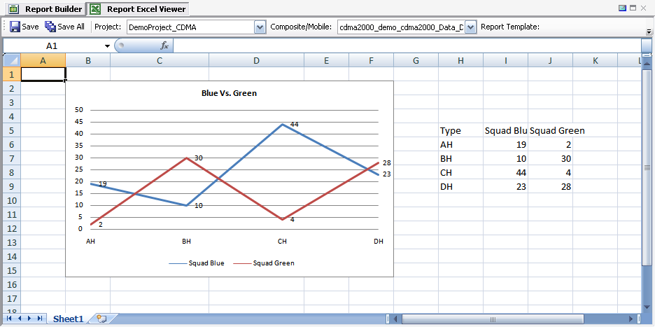
Apply Device Attribute
You can attach certain attributes to mobile data (see
Device Attribute Assignment) so that mobile data can be identified by its attributes. For example, consider that you have data from two operators, Blue and Green. You can import this data into the same dataset, and set attributes to Blue and Green, respectively. In the report template, you can define the report with data of the Blue attribute, Green attribute, or both.
Check the checkbox in front of each attribute to include that attribute in the definition.
When generating the final report, the attributes will be used to identify what data is to be considered for reporting. See
Generate Report From Report Template.
You can also check the Enable delta between different device attributes option to generate the delta between the data of two different attribute sets. A plot band must be defined so that the delta can be presented in a chart.
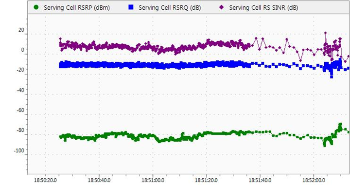
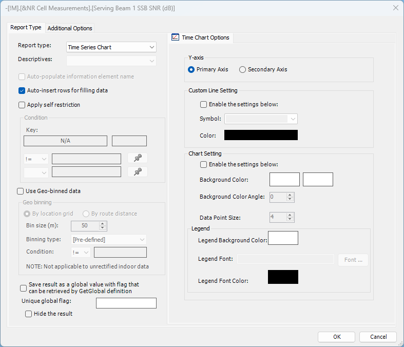
2.2.3.3 Define Time Series Chart
Time Series Chart option allows users to define measurement per time charts. Defining Time Series Chart is similar to defining a regular chart without the need to select Descriptives and related options (fixed selection of measurement values over time is used). Time Series Chart option allows adding multiple series/measurements to a single chart by drag-and-dropping additional measurements to existing report element. All of the standard Report Builder filtering options supported.
Time Chart Options tab allows users to change Y-axis assignment (applicable to report elements having multiple series/measurements assigned), customize series symbol and line color, chart background coloring and legend background coloring and font color and type.
Resize option is available from right click context menu to change previously defined chart element dimensions. Remove Correlation/Time Series Chart option is available too from right click context menu to remove selected chart element from Report Builder design area.
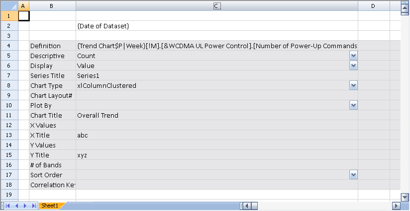
2.2.3.4 Define Trend Chart
Defining Trend chart is similar to defining a regular chart, except that you can select periodicity — Hourly, Daily, Weekly, and Monthly — for the trend report.
2.2.3.5 Define Single Chart
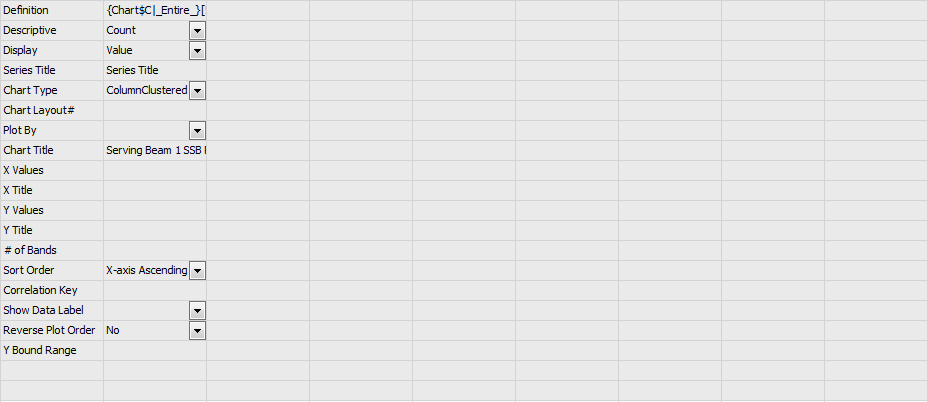
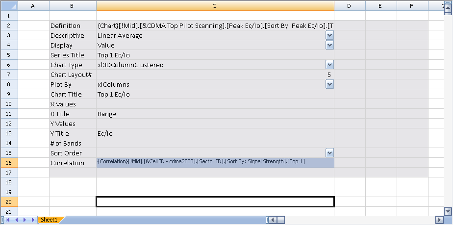
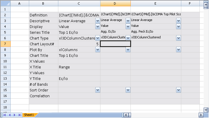
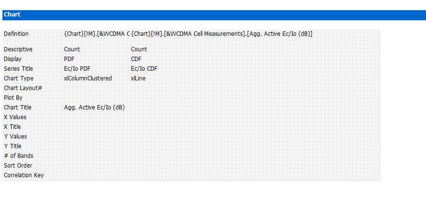
As an example, you can drag-and-drop the IE cdma2000 > CDMA Top Pilot Scanning > Peak Ec/Io >Top 1 from the Metric List into the Report Editor, and select Chart > Linear Average from the pop-up menu. When moving the mouse, an area will be dynamically highlighted in light grey. This area defines the chart location and size. After you move the mouse to the bottom-right corner of the desired chart area, left-click and the definition will be generated in the Report Editor. Some of the definitions are automatically filled in, but you can manually edit some of the fields to adjust the display of chart to your preference.
The first column in the highlighted area is the title of the definition, and the series definitions start from the second column. Each column represents one series of the chart.
The following information is used to define a series:
Definition | Define the IE with a formatted string including the size of the chart area. (Do not edit this information!) |
Descriptive | Select what to calculate for the IE. For each plot band, one value will be computed and those values will be defined as the Y values. The plot band of this IE, by default, will be defined as X values, unless a correlation metric is defined. |
Display | Select what to display in the chart as the Y values. The options are Value, PDF, and CDF. |
Series Title | Define a title for the series. |
Chart Type | Select a chart type. These chart types are fully compatible with those in Microsoft Office Excel 2007. However, if an earlier version of Excel is installed, some of the chart types will not be viewable. |
Chart Layout # | Excel provides a set of predefined layouts for each chart type. Each layout is indicated by an integer number. See Available Chart Types for an overview. You can refer to Excel for more detailed information. |
Plot By | Indicates the way columns or rows are used as data series on the chart: xlColumns or xlRows. |
Chart Title | Define a title for the chart. This title must be defined only in the second column; the other columns must be left blank. |
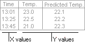
X Values | The starting Cell label of the X-values. By default, the X-values of the chart will be the plot band of the metric, and the Y-values will be the values (computed by the selection of the "Descriptive") that are allocated in each band. If a correlated metric is defined for this metric, the X values will be the plot bands of the correlated metric. This value will be automatically filled when the final report is generated. |
X Title | Title for the X-axis. |
Y Values | The starting Cell label of the X-axis values. This value will be automatically filled when the final report is generated. |
Y Title | Title for the Y-axis. |
# of Bands | Define the number of bands to be considered for generating the chart. |
Sort Order | Define the sort order for sorting the Y-axis values. The options are Ascending, Descending, and None. |
Correlation Key | By default, the X-axis value is the plot band assigned to this IE. For some cases, you can correlate this IE with another IE and use the plot band of that IE for the X values. |
Show Data Label | Turns on and off data label display. |
Reverse Plot Order | Reverses the order of plot band ranges if set to Yes. |
Y Bound Range | Y-axis range and scale is by default set to include all data values. User may explicitly set Y-axis range by populating this field using LowBound~HighBound syntax (e.g. 0~100). In case when different Y Bound Range definition is used for multiple measurements plotted against same (primary or secondary) Y-axis, the last measurement definition will be used. In case of incorrect syntax default automatic Y-axis scale fit will be used. |
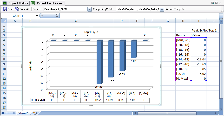
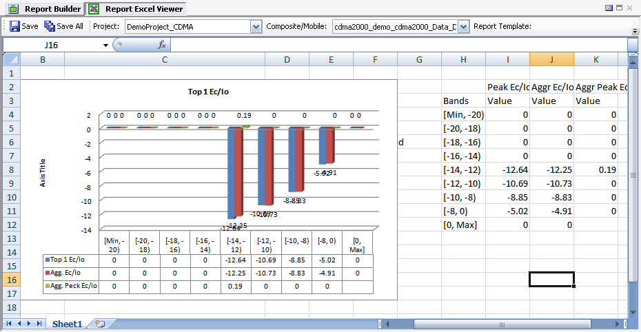
The report template shown above will result in a final report similar the one shown below. The H and I columns of the spreadsheet are generated by TEMS Discovery and are used by Microsoft Office Excel to generate the chart. Do not delete or hide this data.
For example, if you want to create a chart to visualize the linear average of the Peak Ec/Io of each serving sector, this metric can be correlated with
Common > Cell ID - cdma2000 > Sector ID > Sort By: Signal Strength > Top 1. Drag-and-drop that metric from the
Metric List into the
Correlation cell, as shown below.
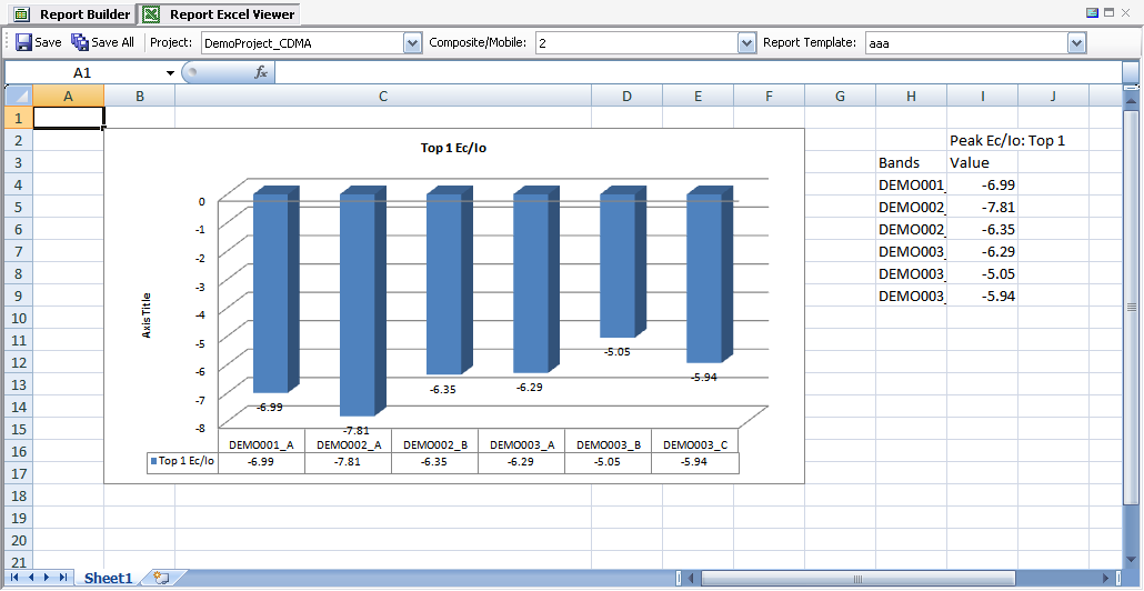
The final report will be similar to the following:
For the example shown above, you can even elect to sort the Peak Ec/Io in Ascending or Descending order so that the chart can be better visualized. If you further define a # of Bands (for example, 5), only the stronger or weaker 5 serving sectors will be shown in the chart.
Of course, you can elect to correlate with any other metrics, and, by combining those charting options, you can produce a rich report just by dragging-and-dropping data.
2.2.3.6 Define Multi-series Chart
You can define more than one series in a single chart by dragging-and-dropping another IE into the column immediately after the previous series. Other than defining the chart area (the highlighted area in light grey), all operations are the same as for defining the first series.
For example, refer to the following report template, which defines three series. For Chart Layout #, Plot By, Chart Title, and Correlation, only the first series requires definition. The other series will apply the same settings.
The report template shown above will result in a final report similar to the one shown here:
The chart type for different series can be set to different types. This way, one series can be plotted as the xlColumn type and the other can be plotted as the xlLine type. However, the mixed chart type can only be defined to a 2D chart type. If you define a mixed 3D chart type, or one to the 2D type and another to the 3-D type, all the series will be plotted to the chart type of the first series.
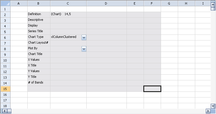
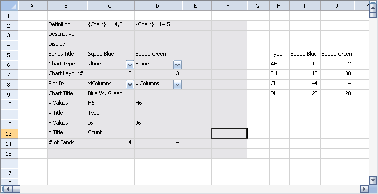
2.2.3.7 Define Chart Skeleton
In some circumstances, you may want to manually define a list of X-values and Y-values one by one. Each value could be computed by a Microsoft Office Excel formula, constant value, or cross-referred value; or computed by TEMS Discovery through a Single Value report type. TEMS Discovery provides a way to define a chart skeleton and, when generating the final report, TEMS Discovery will create the chart based on the definition.
To define a chart skeleton, right-click the Report Editor and select Chart Skeleton from the context menu. As when a chart is defined, an area will be dynamically highlighted in light grey while moving the mouse. At the right-bottom corner of the desired chart area, left-click, and the following definition will be generated in the Report Editor.
For this skeleton, you need to at least manually define the starting cell label of X values and Y values, along with the # of Bands. Cross referencing is allowed, but the format of the reference should be as such: 'Sheet Name'!M24. Be sure to place an exclamation mark (!) after the sheet name. The following is an example of a well-defined chart skeleton.
The report template shown above will result in a final report similar to the one shown here:
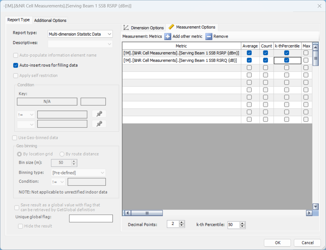
2.2.3.8 Define Multi-dimension Statistic Data
Multi-dimension Statistic Data report type allows user to run numerous statistical calculations for selected metrics and drill down per device attributes, date and time, UDRs or even other metrics added as dimension. For each of selected measurements, user may select one of more statistical operations such as Average, Count, k-thPercentile, Minimum, Maximum, StdDev, StdDevp, Sum, Var and Varp.
2.2.3.9 Define Statistic Data
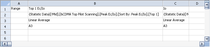
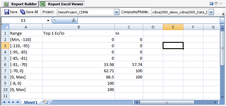
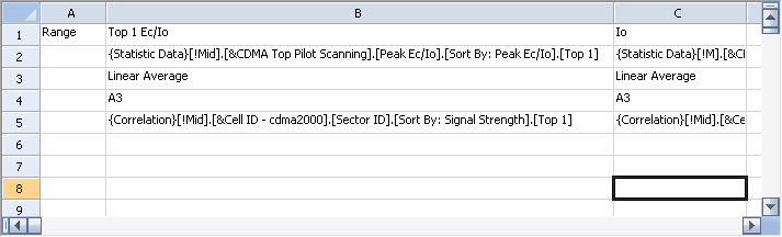
You may choose to describe a metric in a tabular format. Drag-and-drop a metric and select Statistic Data in the Report Options. The definition that will be generated is shown below.
Figure 1
Cell B2 (the cell that the metric is dropped into) defines the metric information, Cell B3 defines what to compute, and, by default, Cell B4 defines where the starting cell is to place the range. If you don't want the range to be listed, clear the cell. You can list other metrics side-by-side by defining another Statistic Data report in the C column; however, all of the metrics must have the same plot band definition.
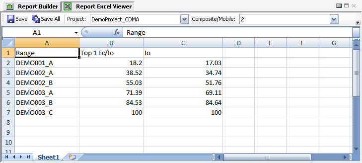
Following is the final report generated:
Figure 2
Simply generating statistic data per its own plot band is not enough. More desirable information is the correlation between two metrics. In Figure 1, you can drag-and-drop another metric to Cell B5 and define it as the correlation metric. For example, you can drag-and-drop Common > Cell ID - cdma2000 > Sector ID > Sort By: Signal Strength > Top 1 into Cell B5, as shown below.
Figure 3
Be aware that if you define other metrics side-by-side, all of these metrics must have the same correlation defined. In this example, Cell C5 must be the same as Cell B5. The final report generated from the above example is shown below:
Figure 4
The above example lists the linear average of Ec/Io and Io of each sector’s coverage. To correlate with Cell ID - <technology> under the Common tree node, scanner data and its corresponding cell configuration must all be imported to the same project.
2.2.3.10 Define Tabular List
You may use the Tabular report type to create a tabular list of multiple metrics. You need to reserve at least three columns to the left for Time, Latitude, and Longitude.
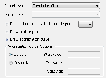
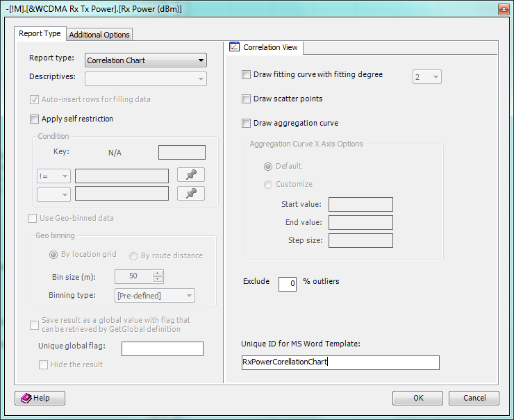
2.2.3.11 Define Correlation Chart
You may include one or more correlation charts in your report template.
One or more of the following options can be included in a correlation chart:
• Draw fitting curve with 1~4 fitting degree
• Draw scatter points
• Draw aggregation curve. This option allows you to divide the X-axis metrics into multiple steps, and TEMS Discovery will calculate the corresponding aggregate values and Y‑axis metrics for each of the steps and draw lines connecting adjacent data points.
− With the Default option, TEMS Discovery will find the ranges from all available data points and automatically assign up to 10 steps.
− For predictable X-axis steps, the Customize option is recommended. Define Start value, End value, and Step size according to the nature of the X-axis metric.
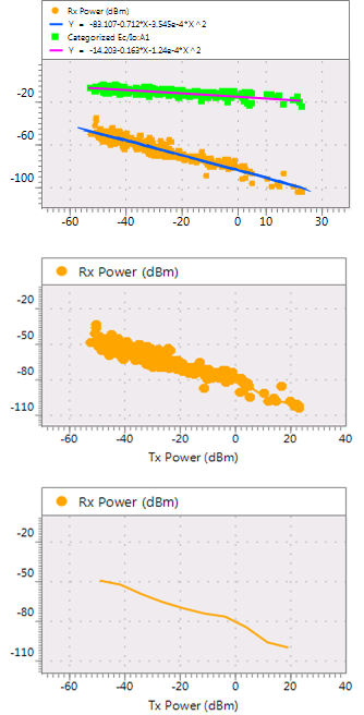
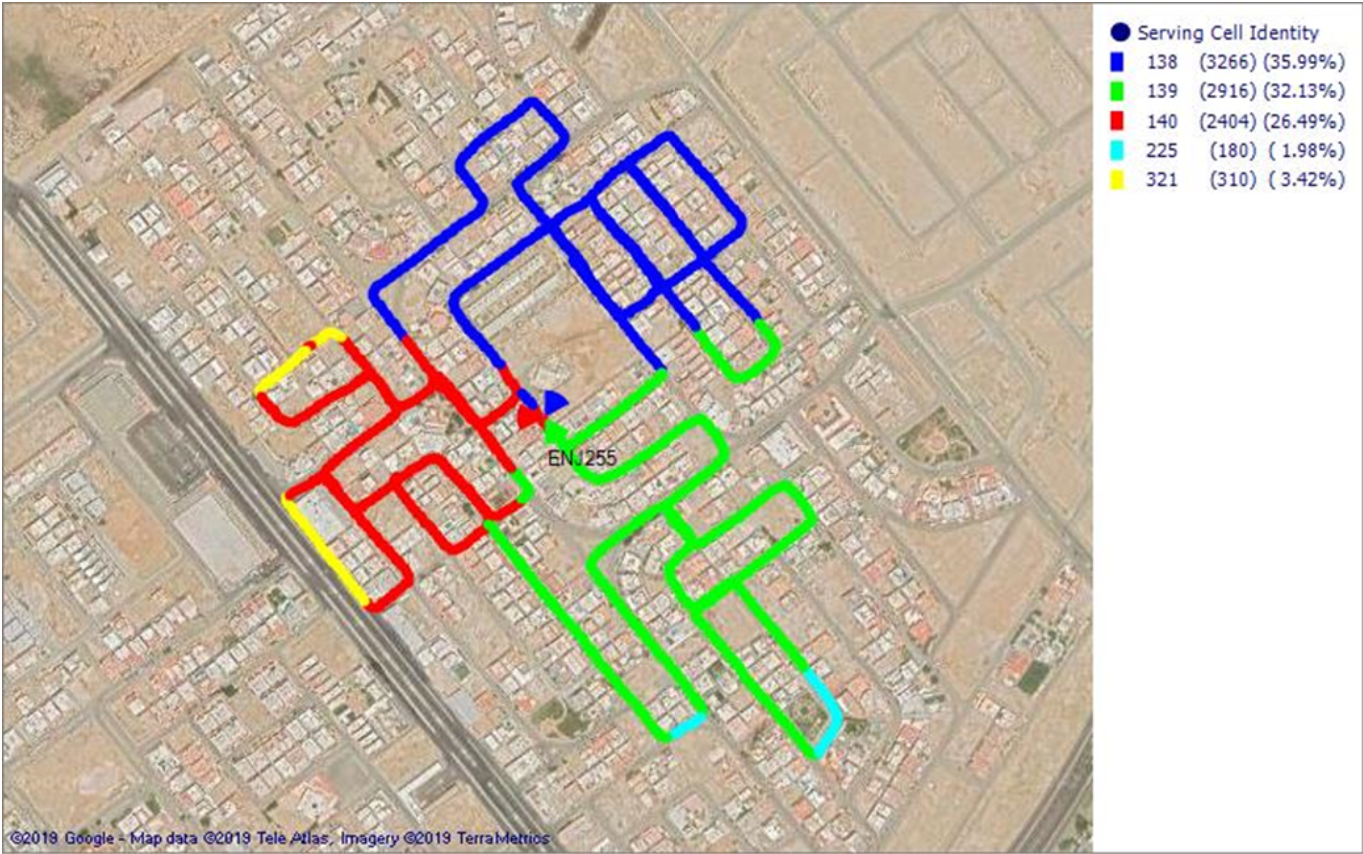
Following is the sample output expected for a final report:
To create a report like this, do the following:
17. Drag-and-drop the X-axis metric from the Metric List into a cell in the report template.
18. Select Correlation Chart as the report type, and define other settings as necessary.
19. Click OK, and drag the mouse to define the chart space.
20. Left-click to finalize the chart space.
21. Drag-and-drop the Y-axis metric from the Metric List into the gray chart space.
22. Repeat step 5 for additional Y-axis metrics.
23. Resize cell height or cell width and format the cells in Excel.
The final template may look something like this. The content above the chart space is automatically filled by TEMS Discovery and will not appear in the final report output. Experienced users may further edit the contents of those cells to alter the final output.
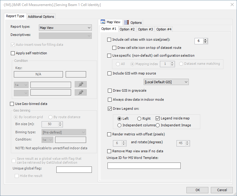
2.2.3.12 Define Maps
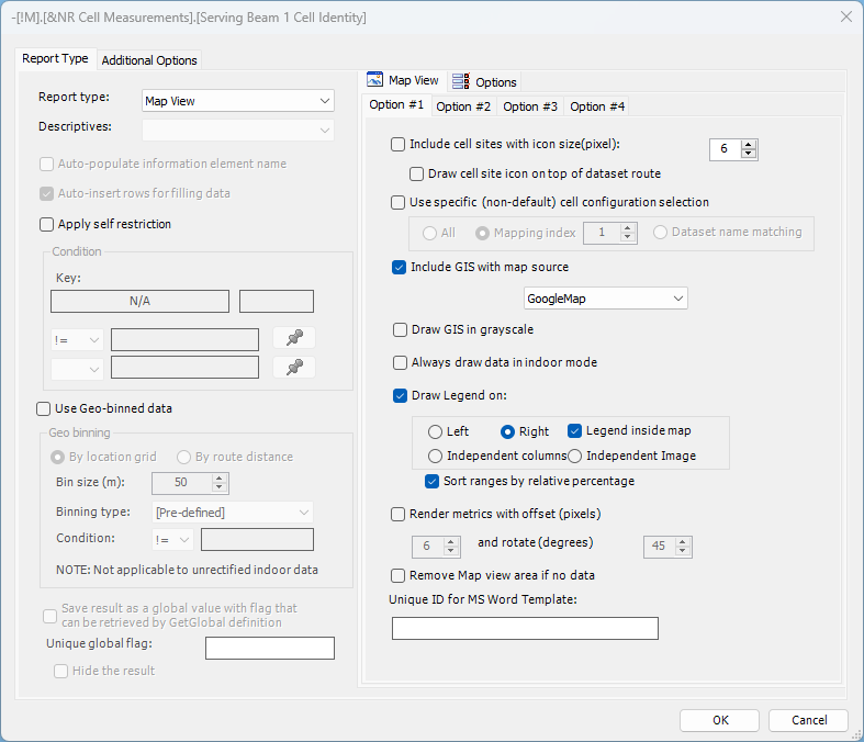
Map View report type can be used to generate maps in measurement report. Following previously described method you may drag-and-drop selected metric into the Report Editor, select Map View report type, specify various map and filtering options and then define map element size as in case of Chart report type. User may include more than one measurement into single map view report element by dragging-and-dropping additional IEs into map area created off of the first IE. All of the Map View options are based on selections made with the first information element except for Data point icon size (pixel), Hide data points, Draw data label with font and Custom Metric/Event Name text box option all located in Option #2 tab.
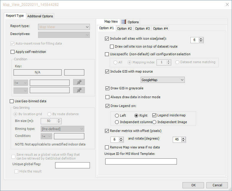
Map View options included on ‘Option #1’ tab:
• ‘Include cell sites with icon size(pixel)’ check box includes one or multiple cell configurations with specified cell site size.
• ‘Draw cell site icon on top of dataset route’ check box if selected will draw cell sites on top of dataset route, otherwise cell sites will occupy layer below measurements.
• ‘Use specific (non-default) cell configuration selection’ option, if turned on, will allow user to select non-default cell configuration by one of the following selection methods:
o ‘All’ sub-option will include all cell configurations defined in the selected project
o ‘Mapping index’ sub-option will select cell configuration with a given index (defined under
Project Properties - Cell Configuration)
o ‘Dataset name matching’ sub-option will attempt to select cell configuration with the name matching the one of the selected dataset
• ‘Include GIS with map source’ option will include map backdrop as specified in the drop down list including [Local Default GIS] as configured in
Project Properties - GIS Settings, or one of the online map options.
• ‘Draw GIS in grayscale’ check box if selected will render map backdrop in grayscale.
• ‘Always draw data in indoor mode’ option will use indoor mode representation for projects including indoor data regardless if geo-rectified.
• ‘Draw Legend on’ option will include legend in the map by choosing one of the following selections:
o ‘Left’ will place legend on the left side of specified report element area. ‘Legend inside map’ check box determines if legend is separated from map area.
o ‘Right’ will place legend on the left side of specified report element area. ‘Legend inside map’ check box determines if legend is separated from map area.
o ‘Independent columns’ will place legend information outside and to the right of specified report element area in the form of independent Excel columns with legend information matching report element area height.
o ‘Independent Image’ will place legend image outside and to the right of specified report element area with its height matching the one of report element area and width adjusted in size to include all legend information.
o ‘Sort ranges by relative percentage’ option will sort legend plotband ranges in descending order of data samples.
• ‘Render metrics with offset (pixels)’ check box if selected will add offset between measurements if more than one is added to the map with specified pixel size and relative angle.
• ‘Remove Map view area if no data’, if selected, will cease to generate map output if no measurement data samples are available.
• ‘Unique ID for MS Word Template’ option may be used to define Map View report element reference to be used for generating reporting output in
MS Word or Power Point file format.
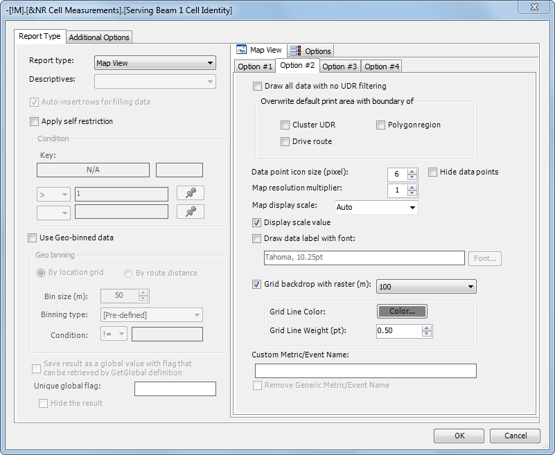
Map View options included on ‘Option #2’ tab:
• ‘Draw all data with no UDR filtering’ check box if selected will disable UDR filtering that may have been specified under ‘Additional Options’ tab.
• ‘Overwrite default print area with boundary of’ set of options allows user to overwrite default print area set in
Project Properties - UDR Configuration for a given Map View reporting element, with option to use Cluster UDR, Polygonregion or Drive route (i.e. measurement data points) for print area selection.
• ‘Data point icon size (pixel)’ list box allows user to specify data point size in pixels.
• ‘Hide data points’ check box allows user to omit data points from the output. This option is typically used when one metric data points are labelled with another metric. In case when data points are hidden with ‘Draw data label with font’ check box unselected, respective measurement will be omitted from map legend.
• ‘Map resolution multiplier’ list box allows user to multiply original map resolution 2 or 3 times.
• ‘Map display scale’ combo box allows user to set specific map display scale from the range of values from 40m to 2km. Default ‘Auto’ map scale will be set to include all measurement data points.
• ‘Display scale value’ check box if selected will display map scale in the bottom left corner of map element.
• ‘Draw data label with font’ check box if selected will include data labels with specified font type and size.
• ‘Grid backdrop with raster (m):’ option will add grid backdrop to Map View reporting element output with specified raster. Grid backdrop is placed in the layer below all measurements and above online map or GIS layer with color and weight of grid lines being fully configurable. Grid raster is indicated at the bottom right corner of Map View reporting output.
• ‘Custom Metric/Event Name’ text box will add custom metric/event name to map element legend (providing ‘Draw Legend on’ option is selected). ‘Remove Generic Metric/Event Name’ check box if selected will remove generic metric/event name, i.e. generic name will be replaced by custom one.
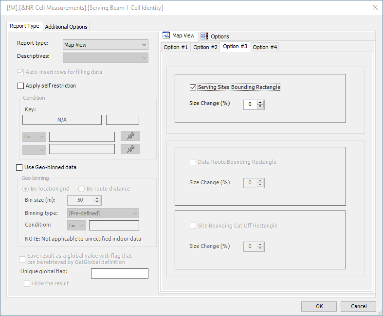
Map View options included on ‘Option #3’ tab:
• ‘Serving Sites Bounding Rectangle’ check box, if selected, will adjust map print area (zoom level) to include serving sites along with measurement data points. Resulting zoom level will still be limited by available discrete zoom levels if online map backdrop is used (e.g. GoogleMap, BingMap). Metric added last to ‘Map View’ report element (the key metric) will be used to determine RAT and measurement device type (UE or scanner) of sector matching proxy metric. Carrier 1/Serving Beam 1 and Top #1 measurements will be used in sector matching for UE and scanner key metric respectively with option applicable exclusively to key metrics defined with GSM, WCDMA, LTE or NR radio technology. New option will not be applicable for GSM scanner key metric as sector matching is not supported in that case. ‘Size Change (%)’ number will allow users to increase effective resulting bounding rectangle size (by specified relative percentage point) for additional buffer around serving sites. ‘Sector matching fallback to BCCH’ global system parameter will be applicable to GSM sector matching (serving site determination).
• ‘Data Route Bounding Rectangle’ check box, if selected, will define inclusion map zoom rectangle to include all data points that can be further fine-tuned by the relative percentage specified under ‘Size Change (%)’ list box. Zero size change will maintain auto zoom, positive values will reduce zoom (zoom out) while negative will increase zoom (zoon in). Size change is uniformly applied in all directions.
• 'Site bounding cut off rectangle' check box, if selected, will define exclusion map zoom rectangle to cut off any area outside 'Site bounding cut off rectangle’ while lays inside 'Data Route Bounding Rectangle'. Similarly, 'Site bounding cut off rectangle' may be fine-tuned by its own ‘Size Change (%)’ list box.
• Note that in case when online map (e.g. GoogleMap, BingMap) is used zooming rectangle adjustment is tied to online map fixed zoom levels and may be relatively coarse.
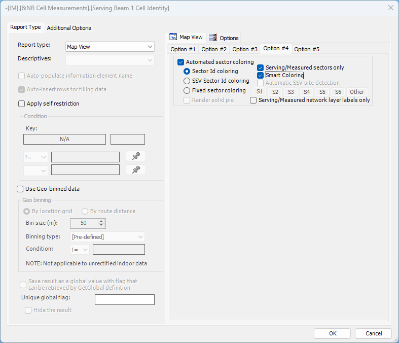
Map View options included on ‘Option #4’ tab:
• ‘Automated sector coloring’ check box will enable use of automated sector coloring options in reporting output.
• User may decide between standard [1] ‘Sector Id coloring’, [2] ‘Fixed sector coloring’ and [3] ‘SSV Sector Id coloring’ options.
• [1] ‘Sector Id coloring’
o Applicable to standard sector id metrics only (full list available under Automated Sector Coloring), sector id metric needs to occupy top map layer (i.e. it is added last to Map View report element) with matching RAT cell configuration defined in associated project. o ‘Serving/Measured sectors only’ sub-option may be selected to limit sector coloring to serving (applicable to UE measurements only) or measured (Top Nth) sectors identified in selected dataset.
o ‘Smart Coloring’ sub-option may be used to prevent color collisions in automated sector coloring by dynamically assigning limited set of colors (i.e. “smart colors”) to highest ranked serving/measured sectors in lieu of using fixed plotband color assignment. Use of ‘Smart Coloring’ is conditioned on enabling of ‘Serving/Measured sectors only’ sub-option. ‘Smart Coloring’ may be used with ‘Sector Id coloring’ (e.g. for cluster drives) or ‘SSV Sector Id coloring’ options (e.g. for SSV drives for which SSV sector color customization is required).
‘Smart Coloring’ is applicable to single radio carrier datasets. Standard ‘Sector Id coloring’ option should be used for multi-carrier analysis. ‘Smart Coloring’ is effectively supported for cluster radii of up to 6km including up to 150 sectors.
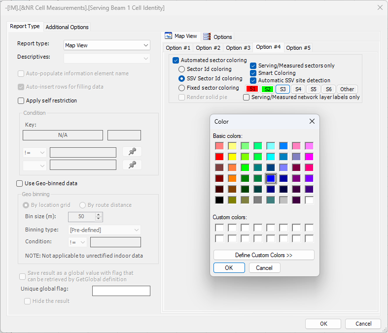
• [2] ‘SSV Sector Id coloring’
o Special type of Sector id coloring allowing user to make custom SSV sector color selection and apply it to Sector id metric (data point) coloring.
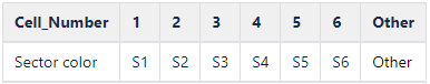
o Applicable to standard sector id metrics only (full list available under Automated Sector Coloring), sector id metric needs to occupy top map layer (i.e. it is added last to Map View report element) with matching RAT cell configuration defined in associated project. o SSV sectors are either identified automatically or by populating Cell_Number cell configuration parameter:
Automatic SSV site identification is enabled via ‘Automatic SSV site detection’ sub-option with site having highest combined sector data sample count identified as SSV site. SSV site serving/measured sectors' coloring is based on respective Sector_ID last character in line with the table below, where S1 to S6 indicate colors set via color assignment command buttons. Non-SSV site serving/measured sectors’ coloring is based on Sector Id plotband color assignment. Non-serving/non-measured sectors’ are rendered in outline (i.e. with transparent sector pie) with its color set by Other color assignment command button if ‘Serving/Measured sectors only’ sub-option is enabled, otherwise sector coloring follows Sector Id plotband color assignment.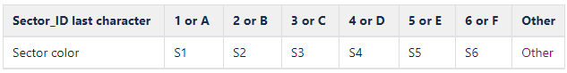
Manual SSV site identification is based on user populating
Cell_Number cell configuration parameter with 1, 2, 3, etc. corresponding to sectors 1, 2, 3, etc. and sector color determined via S1 to S6 color assignment command buttons, in line with the table below. SSV sector with
Cell_Number value falling out of 1-6 range (e.g. 0, 7, A, X, *) will use color specified under
Other color assignment button. Serving/measured sectors with Cell_Number missing or not populated will have their coloring based on Sector Id plotband color assignment. Non-serving/non-measured sectors’ are rendered in blue outline (i.e. with transparent sector pie) if ‘Serving/Measured sectors only’ sub-option is enabled, otherwise sector coloring follows Sector Id plotband color assignment. Users will need to ensure that appropriate mapping configuration is selected if Text File (Delimited) format is used, in all other cases
Cell_Number parameter needs to be defined explicitly.
• [3] ‘Fixed sector coloring‘
o ‘Fixed sector coloring‘ option may be used to apply custom sector color for up to 6 logical sectors in all RAT layers. Sector color is defined by selecting corresponding sector button, S1 to S6. ‘Other’ color selection may be used as a wildcard for exceptional sites (e.g. out of cluster sites).
o ‘Fixed sector coloring‘ option requires that cell configuration sector naming adhere to the naming convention below:
o ‘Serving/Measured sectors only’ sub-option may be selected to limit sector coloring to serving (applicable to UE measurements only) or measured (Top Nth) sectors identified in selected dataset.
o ‘Smart Coloring’ sub-option may be used to prevent color collisions in automated sector coloring by dynamically assigning limited set of colors (i.e. “smart colors”) to highest ranked serving/measured sectors in lieu of using fixed plotband color assignment. “Smart colors” matching user-defined SSV sector colors not used for non-SSV sector coloring.
• ‘Render solid pie’ check box is applicable to all automated sector coloring options except when ‘Serving/Measured sectors only’ sub-option is enabled in which case serving/measured sectors are always rendered solid and non-serving/non-measured in outline.
• ‘Serving/Measured network layer labels only’ option allows users to restrict label display to serving/measured network sub-layers. Label displaying restrictions are applied on top of existing RAT labeling controls specified under ‘Overwrite cell configuration view settings’ configuration area.
Map View options included on ‘Option #5’ tab:
• ‘Overwrite cell configuration view settings’ check box selection will overwrite selected default/user defined settings (layering order, pie radius and width, labeling, etc.) in a given report element.
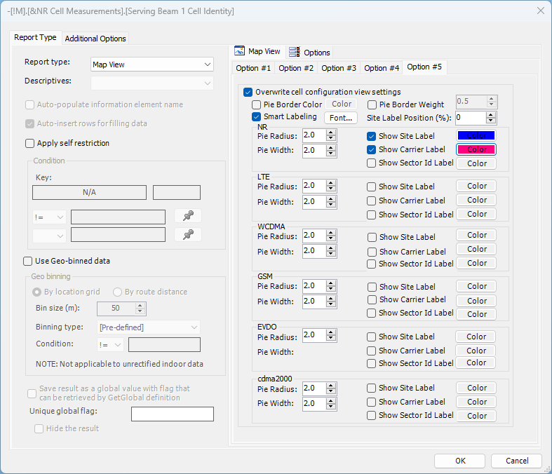
o ‘Pie Border Color’ and ‘Pie Border Weight’ options allow customization of selected cell configuration sector border color and line weight. The settings are irrelevant if ASC ‘Render solid pie’ or project level 'Render solid pie’ settings are enabled will the latter applicable if ASC is disabled. Pie border color customization is irrelevant too if ‘Fixed sector coloring’ or ‘SSV Sector Id coloring’ ASC options are enabled. Pie border color and weight customization will only be applied to non-serving/non-measured network layers if standard ASC is enabled (‘Serving/Measured sectors only’ sub-option disabled). Pie border color and weight customization will only be applied to non-serving/non-measured sectors if ‘Serving/Measured sectors only’ ASC sub-option is enabled.
o Use of ‘Smart Labeling’ option is determined via respective check box; Turning off the option will display labels regardless of their overlapping.
o Font button may be used to customize label font, style and size applicable to all RAT layers.
o ‘Site Label Position (%)’ list box may be used to modify site label relative position; Default label position is set at the bottom right with respect to site symbol center at the distance required to avoid overlap with carrier labels (0%); User may bring site label closer or farther using position adjustment in -100% (site symbol center) to 100%
(2x original label distance) range.
o Pie radius/width and site, carrier or sector Id labeling with custom coloring is available per RAT.
o RAT layer ordering is based on sector radii (smaller placed on top of larger sectors) and cell configuration name (alphabetical) if same sector radius size is defined.
o Report element cell configuration viewing settings are applied regardless of if single or multiple cell configurations are selected.
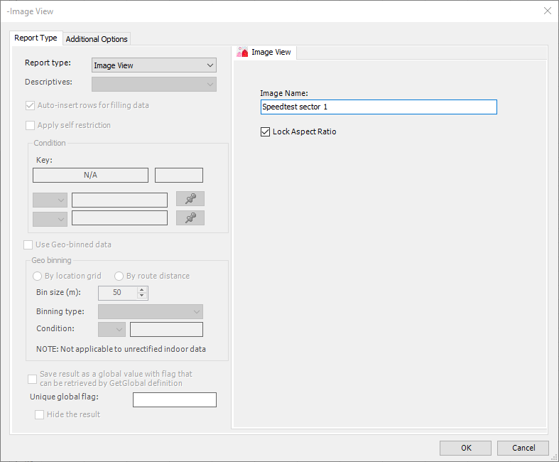
2.2.3.13 Define Image
New Image report element may be added to report template by using Add Image option of Report Template Builder Right-Click Menu.
User will need to specify image file name reference used in locating image file during report generation. Selection of ‘Lock Aspect Ratio’ check box will maintain original image aspect ratio, otherwise image will be resized to fit into user-specified report element dimensions. Manual or ADP report generation process will attempt to locate image file with specified image name reference within a subset of image repository associated with current:
• dataset, if selected data scope is limited to a single dataset,
• project, if selected data scope includes multiple datasets.
First matching name image will be returned if one is found, blank/empty output will be generated otherwise.
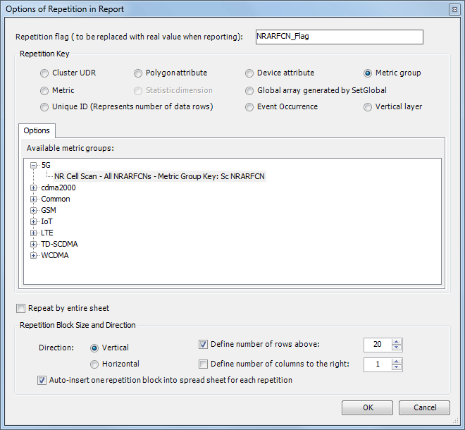
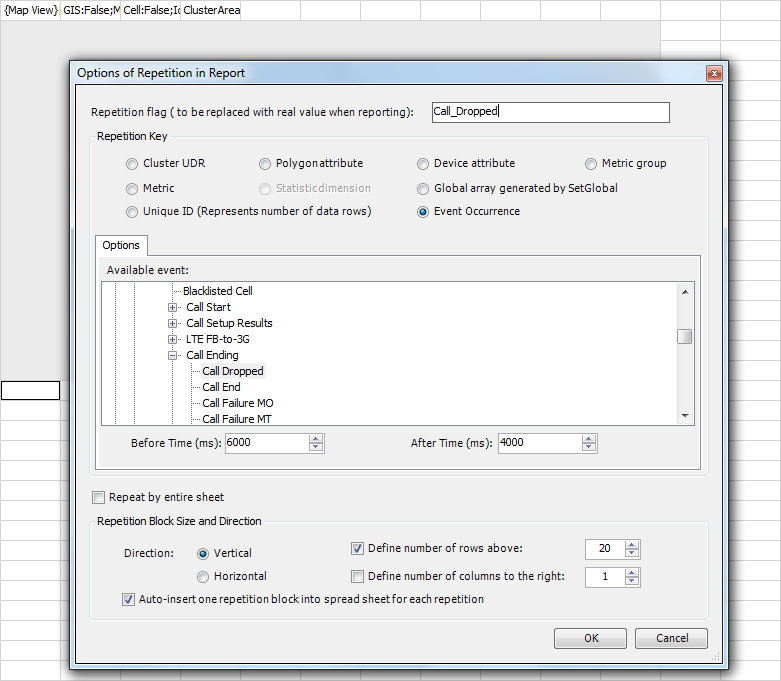
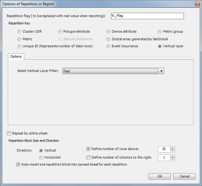
2.2.3.14 Options of Repetition in Report
In cases where you need to generate a report with repetitive information (e.g., for each cluster UDR), you can define the report type and descriptive in a block of cells in the report template as usual, and then provide repetition options in the first cell immediately under the definition block. TEMS Discovery can then automatically repeat the report generation of the definition block for each available cluster UDR in the data source.
To access the following dialog, right-click at the first cell immediately under the definition block on which you intend to repeat, and select Repetition in Report from the context menu.
• Repetition Flag. Repetition flag is a user-defined flag that will be placed in any cell of the definition block as a placeholder. During report generation, this placeholder will be replaced with the value of the Repetition Key. Select Repetition Flag from the right-click context menu, and place the flag at the desired location. If the flag will be placed inside any text, including online script, embrace the flag with braces, like this: "{{RepeatFlag}ServingSector}"
• Repetition Key. You can select from several different repetition keys:
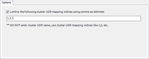
− Cluster UDR. Select this option to make TEMS Discovery repeatedly report on each available cluster UDR in the data source. You can also enter a list of cluster UDR mapping indexes to limit the reporting scope, using commas as delimiters to separate the indices. For more information about cluster UDR mapping, see
Project Properties – UDR Configuration.
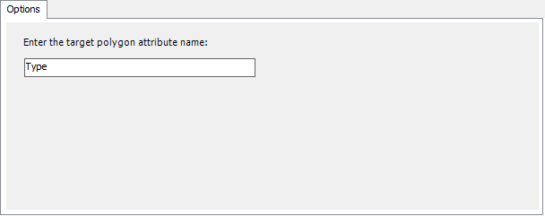
− Polygon attribute. A cluster UDR can contain a number of polygons, and each polygon can be assigned to a number of attributes. Those attributes can be utilized as a repetition key for reporting. For more information about creating UDRs and assigning attributes to polygons, see
GIS in Map View.
For this repetition type, select a default geo region in the
Report Generation dialog so that the definition block will be reported on polygon regions with each unique attribute defined in this default geo region.
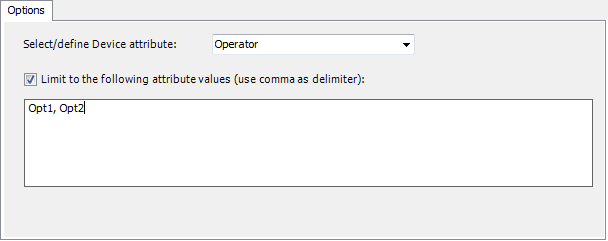
− Device attribute. Select this option to make TEMS Discovery repeatedly report on each available device attributes in the data source. You can also enter a list of attribute values to limit the reporting scope, using commas as delimiters to separate the values. Device attributes will normally be taken from drive test data. For information about creating new device attributes, see
Device Attribute Assignment.
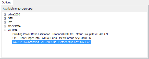
− Metric Group. Select this option to make TEMS Discovery repeatedly report on each specific metric group key in the data source.
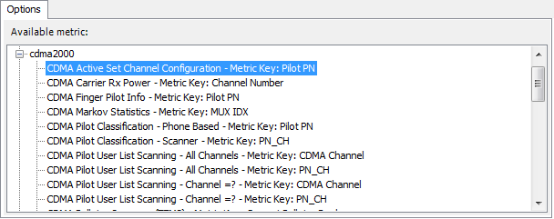
− Metric. Select this option to make TEMS Discovery repeatedly report on each distinct value of the specific metric key in the data source.
− Global Array (From SetGlobal). Select this option to make TEMS Discovery repeatedly report on the array defined by SetGlobal in
Report Options. This array contains distinct values of the selected metric.
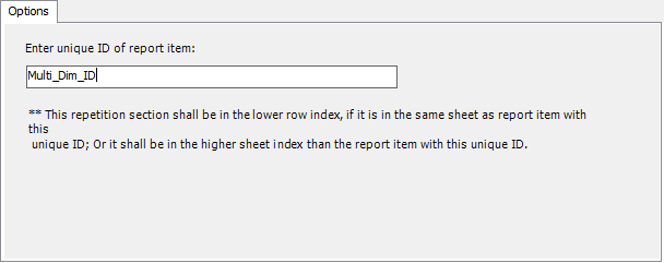
− Unique ID (represents number of data rows). The number of rows that will be occupied by the results of report types such as Statistic Data, Multi-dimension Statistic Data, and Tabular is dynamic and unknown in the design stage. However, you can assign a unique global ID (on the
Additional Options tab in
Report Options) for any of these report types, and refer to this unique ID in repetition definition. In this way, you can define the number of repetitions of a block to be the same as the number of data rows generated.
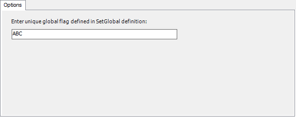
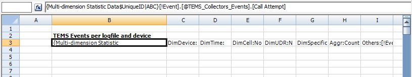
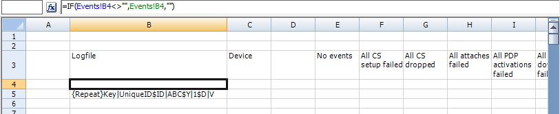
The most useful usage case is to define cross-references to the results of report types. For example, we defined Multi-dimension Statistic with unique ID "ABC" in sheet "Events", as shown below.
In another sheet which must be a sheet not in front of the above sheet, we created a formula "=IF(Events!B4<>"",Events!B4,"")" in Cell B4 (it doesn’t have to be in Cell B4) that refers to Cell B4 in the above sheet, "Events." Then, we defined repetition to repeat Row 4 for the number of times that is represented by the unique ID "ABC" in sheet "Events". As a result, Row 4 will be repeated by the same number of times as the number of data rows generated for the defined Multi-dimension Statistic, and each row will be calculated corresponding to each data row of the multi-dimension statistic data.
− Event Occurrence. Select this option to generate designated reporting block for custom time window around every occurrence of designated pre-defined or user-defined event. Pre-defined or user-defined event need to be selected from event data tree with time window defined by Before Time and After Time values in milliseconds. As a minimum one of the window thresholds needs to be set at non-zero value. Repetition flag value is populated as <Event name> <Occurrence Timestamp>.
Event occurrence repetition will produce one reporting block per event occurrence. Typical use case may be generating reporting block (a set of maps, charts, tables, etc.) for a certain time window (e.g. 30s) prior to every drop call. Event occurrence repetition will produce no output if repetition event is not present in selected dataset.
− Vertical layer. Select this option to generate designated reporting block for every altitude range of selected vertical layer filter configuration. Repetition flag value will be populated as <Vertical layer:> low limit - high limit <m> (e.g. Vertical layer: 5-10 m).
Vertical layer repetition will produce no output if [GPS Additional Information].[Altitude (m)] information is not available in selected dataset, or its range is not matching vertical layer filter configuration.
2.2.4 Generating MS Office Word and Power Point Report
TEMS Discovery MS Word and Power Point reporting currently supports tabular data, charts and images (map, correlation chart). MS Word and Power Point report can also have static contents (contents that are not required to be replaced during report generation).
2.2.4.1 Requirements
Microsoft Office 2007 or later version
2.2.4.2 MS Word and Power Point reporting templates
In order to generate MS Word or Power Point report from TEMS Discovery user should design standard MS Excel .xlsx report template and accompany it with MS Word .docx or Power Point .pptx report template using the same name and including place holder references to source template reporting elements (limited to tabular data, chart or image).
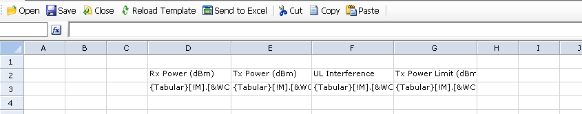
Import tabular data from the source Excel report template
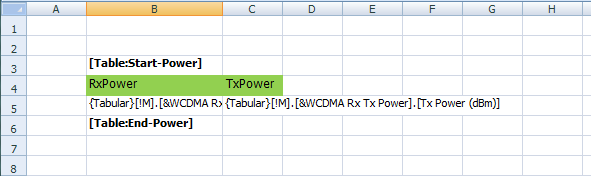
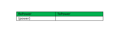
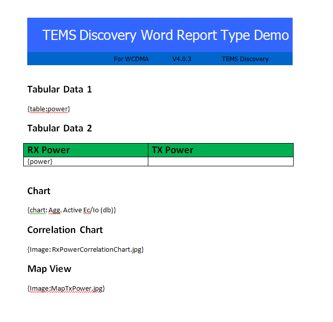
To import tabular data (rows and columns) in MS Word or Power Point mark the rows in the TEMS Discovery Excel report template with [Table:Start-<Table name>] and [Table:End-<Table name>]. See the following example for tabular data using table name tag ‘Power’.
Tabular content may be added to MS Word or Power Point report template in two different ways:
• Add a line in MS Word or Power Point report template using a given table reference in the ‘{table:<Table name>}‘ format.
• Insert a given table reference to the first column of the table having matching number of columns as in the example below.
Import chart data from the source Excel report template
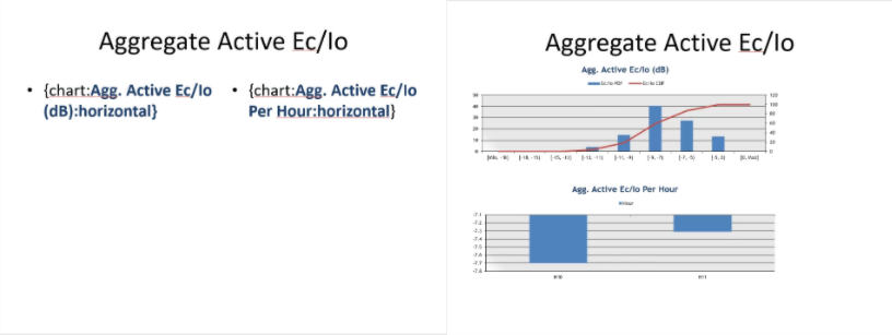
All of the relevant chart elements in the source Excel report template need to use unique Chart Title reference in order to be included in MS Word or Power Point report template. In the example below chart element is defined with the unique ‘Agg. Active Ec/Io (dB)’ title.
To include a chart in MS Word or Power Point report template, a text line including chart reference in the ‘{chart:<Chart title>}‘ format should be added, such as ‘{chart: Agg. Active Ec/Io (db)}‘ in the example above.
Import image data from the source Excel report template
Correlation Chart – Unique ID chart reference should be defined in the source Excel report template Correlation Chart element as in the example below.
To include a correlation chart image in MS Word or Power Point report template, a text line including correlation chart reference in the ‘{Image:<Unique ID>}‘ format should be added, such as ‘{Image: RxPowerCorrelationChart.jpg}’ in the example above.
Map View – Unique ID map reference should be defined in the source Excel report template Map View element as in the example below.
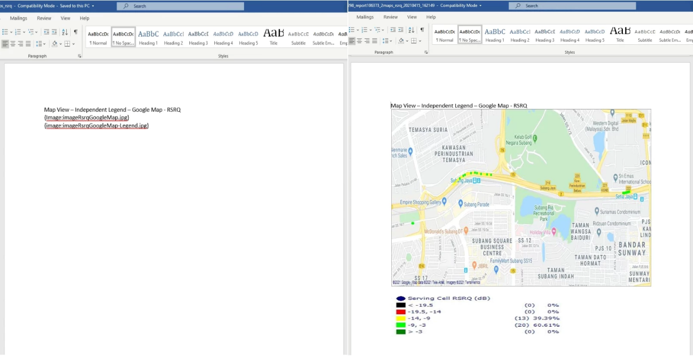
To include a map image in MS Word or Power Point report template, a text line including map reference in the ‘{Image:<Unique ID>}‘ format should be added, such as ‘{Image:MapTxPower.jpg}’ in the example above.
Image View – To include image in MS Word or Power Point report template, a text line including image name reference in the ‘{Image:<Image Name>}‘ format should be added, such as ‘{Image:Speedtest sector 1.jpg}’ in the example below.
Map image size will be automatically adjusted to the size of MS Word text box when placed in it (same is applicable to Correlation Chart and Image output too). This option requires use of ‘In Line with Text’ layout option with image aspect ratio determined by text box size. Image generated this way will not follow paragraph alignment and it will always be left aligned. Note that text box must not be placed in another object such as table.
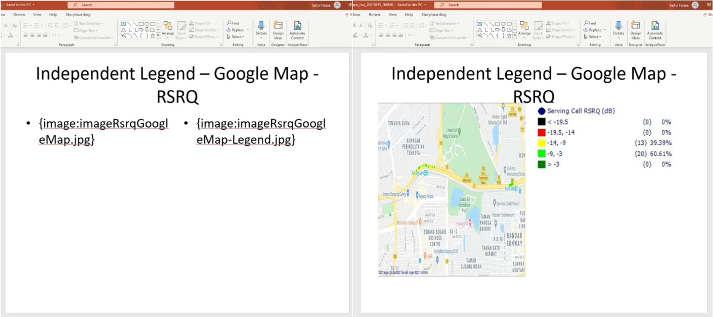
In order to add two report elements to a single MS Power Point slide, 'Two Content' slide layout type need to be used.
The 'Two Content' slide layout type will by default use left-right arrangement. For top-down 'Two Content' arrangement, user will need to add an additional ‘:horizontal’ identifier after Unique ID chart or image reference as illustrated below.
Map legend may be added to MS Word and Power Point reporting output as independent image if ‘Independent Image’ legend option is selected on the Report Type form. In such case, map legend image should be referred in MS Word or Power Point template by appending ‘-Legend’ qualifier to Unique ID map reference.
'Two Content' slide layout type will need to be used in MS Power Point to arrange separate map and legend image placement.
2.2.4.3 Sample Word Report Template
2.2.5 Generate Report From Report Template
A report can be generated from a report template in the following ways:
24. Go to the step Generate Report.
25. Select the target project from the combo box.
26. Select the target data.
27. Click the Generate Report button.
28. The report will be displayed in Microsoft Excel/MS-Word.
29. Expand the tree view to the target mobile data or dataset; then right-click on that target.
30. Select Generate Report.
31. The report will be displayed in Microsoft Excel/MS-Word.
32. Expand the tree view to the target mobile data or dataset; then right-click on that target.
33. Select Generate Report.
34. The report will be displayed in Microsoft Excel/MS-Word.
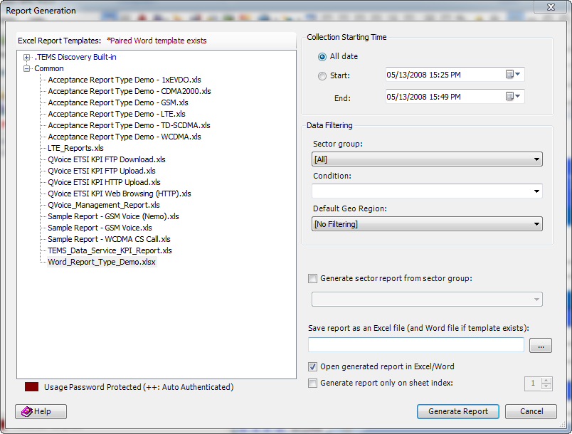
Before the report can be generated from the template, the following Report Generation dialog will open:
• Collection Date. You can report all the data in the selected dataset/mobile, or you can report only on the data collected from a specified start date to a specified end date.
• Data Filtering
− Sector Group. You can report data from all sector groups, or you can select a particular sector group.
− Condition. You can select one or multiple condition expressions on which to filter data points, so that only the data points satisfying the condition expressions will be computed. See
Script Builder for how to define a condition expression.
− Default Geo Region. You can report only the data that falls within a selected geo region. In
Project Properties, you can assign a cluster index for those UDRs created in the
Map View. If you selected
Consider data only in cluster region index and given an index (see
Report Options) in the report template, the target data will be filtered by those indexed cluster UDRs. If you do not define cluster region filtering for some data, that data will be filtered by the default geo region selected in this dialog.
• Generate sector report from sector group. By identifying a sector group, you can force TEMS Discovery to generate a report on that sector group only.
• Save report as an Excel file (and Word file if template exists). You can use the Windows browser to save the report to an Excel file in a target folder, and if the paired Word report template exists, the output Word file will be saved in the same folder.
• Open generated report in Excel/Word. This option will cause the report to be automatically opened when the generation process is finished.
• Generate report only on sheet index. By providing a sheet index, you can force TEMS Discovery to generate a report on that particular sheet only.
After all options have been selected, select a report template and click Generate Report. The final report can also be saved to a file.
If an Excel template has a paied Word template, in another word, has the Word template with the same file name, an indicator “*Paired Word template exists” will be display in the header of the tree view after Excel template selected.
The final report generated will be in the same
Excel format as the report template. If you select a report template with the extension xls, the final report will have an extension of xls, and the same to extension xlsx. In addition, if the paired Word template exists, a final Word report will be generated in the same target folder.
2.2.6 Available Chart Types
Microsoft Excel supports many kinds of charts to help you display data in ways that are meaningful to your audience. You can easily select the type you want from a list of standard or custom chart types.
Following is an overview of some standard chart types and their subtypes. For more detailed information, please refer to Microsoft's online resources.
2.2.6.1 Column Charts
A column chart shows data changes over a period of time or illustrates comparisons among items. Column charts have the following chart sub-types:
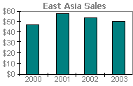
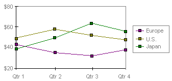
• Clustered Column. This type of chart compares values across categories. It is also available with a 3-D visual effect. As shown in the following chart, categories are organized horizontally, and values vertically, to emphasize variation over time.
• Stacked Column. This type of chart shows the relationship of individual items to the whole, comparing the contribution of each value to a total across categories. It is also available with a 3-D visual effect.
• 100% Stacked Column. This type of chart compares the percentage each value contributes to a total across categories. It is also available with a 3-D visual effect.
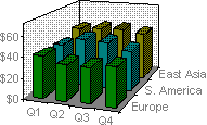
• 3-D Column. This type of chart compares data points along two axes. For example, in the following 3-D chart, you can compare four quarters of sales performance in Europe with the performance of two other divisions.
Note: Data points are individual values plotted in a chart and represented by bars, columns, lines, pie or doughnut slices, dots, and various other shapes called data markers. Data markers of the same color constitute a data series.
2.2.6.2 Bar Charts
A bar chart illustrates comparisons among individual items. Bar charts have the following chart sub-types:
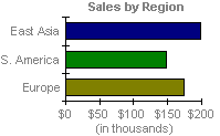
• Clustered Bar. This type of chart compares values across categories. It is also available with a 3-D visual effect. In the following chart, categories are organized vertically, and values horizontally, to place focus on comparing the values.
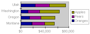
• Stacked Bar. This type of chart show the relationship of individual items to the whole. It is also available with a 3-D visual effect.
• 100 % Stacked Bar. This type of chart compares the percentage each value contributes to a total across categories. It is also available with a 3-D visual effect.
2.2.6.3 Line Charts
A line chart shows trends in data at equal intervals. Line charts have the following chart sub-types:
• Line. This type of chart displays trends over time or categories. It is also available with markers displayed at each data value.
• Stacked Line. This type of chart displays the trend of the contribution of each value over time or categories. It is also available with markers displayed at each data value.
• 100% Stacked Line. This type of chart displays the trend of the percentage each value contributes over time or categories. It is also available with markers displayed at each data value.
• 3-D Line. This is a line chart with a 3-D visual effect.
2.2.6.4 Pie Charts
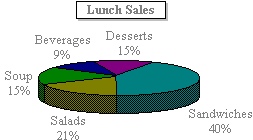
A pie chart shows the size of items that make up a data series (data series: Related data points that are plotted in a chart. Each data series in a chart has a unique color or pattern and is represented in the chart legend. You can plot one or more data series in a chart. Pie charts have only one data series.), proportional to the sum of the items. It always shows only one data series and is useful when you want to emphasize a significant element in the data. Pie charts have the following chart sub-types:
• Pie. This type of chart displays the contribution of each value to a total. It is also available with a 3-D visual effect, as shown in the following chart.
• Exploded Pie. This type of chart displays the contribution of each value to a total while emphasizing individual values. It is also available with a 3-D visual effect.
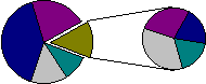
• Pie of Pie. This is a pie chart with user-defined values extracted and combined into a second pie. For example, to make small slices easier to see, you can group them together as one item in a pie chart and then break down that item in a smaller pie or bar chart next to the main chart.
• Bar of Pie. This is a pie chart with user-defined values extracted and combined into a stacked bar. More information
2.2.6.5 XY (Scatter) Charts
An xy (scatter) chart shows the relationships among the numeric values in several data series (data series: Related data points that are plotted in a chart. Each data series in a chart has a unique color or pattern and is represented in the chart legend. You can plot one or more data series in a chart. Pie charts have only one data series.), or plots two groups of numbers as one series of xy coordinates. Scatter charts are commonly used for scientific data and have the following chart sub-types:
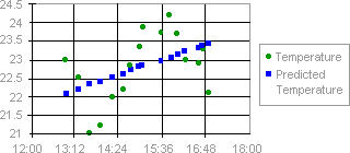
• Scatter. This type of chart compares pairs of values. For example, the following scatter chart shows uneven intervals (or clusters) of two sets of data.
When you arrange your data for a scatter chart, place x values in one row or column, and then enter corresponding y values in the adjacent rows or columns.
• Scatter with Data Points Connected by Lines. This type of chart can be displayed with or without straight or smoothed connecting lines between data points. These lines can be displayed with or without markers.
2.2.6.6 Area Charts
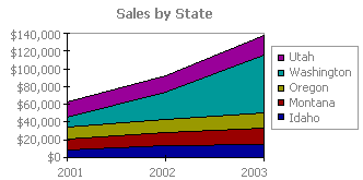
An area chart emphasizes the magnitude of change over time. Area charts have the following chart sub-types:
• Area. This type of chart displays the trend of values over time or categories. It is also available with a 3-D visual effect. By displaying the sum of the plotted values, an area chart also shows the relationship of parts to a whole. For example, the following area chart emphasizes increased sales in Washington and illustrates the contribution of each state to total sales.
• Stacked Area. This type of chart displays the trend of the contribution of each value over time or categories. It is also available with a 3-D visual effect.
• 100% Stacked Area. This chart type displays the trend of the percentage each value contributes over time or categories. It is also available with a 3-D visual effect.
2.2.6.7 Doughnut Charts
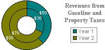
Like a pie chart, a doughnut chart shows the relationship of parts to a whole; however, it can contain more than one data series (data series: Related data points that are plotted in a chart. Each data series in a chart has a unique color or pattern and is represented in the chart legend. You can plot one or more data series in a chart. Pie charts have only one data series.). Doughnut charts have the following chart sub-types:
• Doughnut. This type of chart displays data in rings, where each ring represents a data series. For example, in the following chart, the inner ring represents gas tax revenues, and the outer ring represents property tax revenues.
• Exploded Doughnut. This chart type is like an exploded pie chart, but it can contain more than one data series.
2.2.6.8 Radar Charts
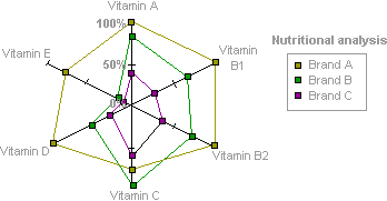
A radar chart compares the aggregate values of a number of data series (data series: Related data points that are plotted in a chart. Each data series in a chart has a unique color or pattern and is represented in the chart legend. You can plot one or more data series in a chart. Pie charts have only one data series.). Radar charts have the following chart sub-types:
• Radar. This type of chart displays changes in values relative to a center point. It can be displayed with markers for each data point. For example, in the following radar chart, the data series that covers the most area, Brand A, represents the brand with the highest vitamin content.
• Filled Radar. In this type of chart, the area covered by a data series is filled with a color.
2.2.6.9 Bubble Charts
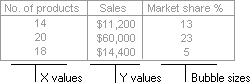
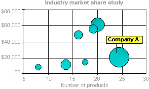
A bubble chart is a type of xy (scatter) chart. It compares sets of three values and can be displayed with a 3-D visual effect. The size of the bubble, or data marker (data marker: A bar, area, dot, slice, or other symbol in a chart that represents a single data point or value that originates from a worksheet cell. Related data markers in a chart constitute a data series.) indicates the value of a third variable. To arrange your data for a bubble chart, place the x values in one row or column, and enter corresponding y values and bubble sizes in the adjacent rows or columns. For example, you would organize your data as shown in the following picture.
The following bubble chart shows that Company A has the most products and the greatest market share, but not the highest sales.
2.2.6.10 Stock Charts
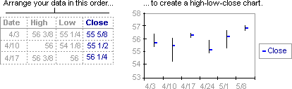
This chart type is most often used for stock price data, but can also be used for scientific data (for example, to indicate temperature changes). You must organize your data in the correct order to create stock charts. Stock charts have the following chart sub-types:
• High-Low-Close. The high-low-close chart is often used to illustrate stock prices and requires three series of values in the following order (high, low, and then close).
• Open-High-Low-Close. This type of chart requires four series of values in the correct order (open, high, low, and then close).
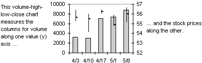
• Volume-High-Low-Close. This type of chart requires four series of values in the correct order (volume, high, low, and then close). The following stock chart measures volume using two value axes: one for the columns that measure volume, and the other for the stock prices.
• Volume-Open-High-Low-Close. This type of chart requires five series of values in the correct order (volume, open, high, low, and then close). More information
2.2.6.11 Cylinder, Cone, or Pyramid Charts
These chart types use cylinder, cone, or pyramid data markers to lend a dramatic effect to column, bar, and 3-D column charts. Much like column and bar charts, cylinder, cone, and pyramid charts have the following chart sub-types:
• Column, Stacked Column, or 100% Stacked Column. The columns in these types of chart are represented by cylindrical, conical, or pyramid shapes.
• Bar, Stacked Bar, or 100% Stacked Bar. The bars in these types of chart are represented by cylindrical, conical, or pyramid shapes.
• 3-D Column. The 3-D columns in this type of chart are represented by cylindrical, conical, or pyramid shapes.
2.2.7 Report Template Builder Repository
Report Template Builder Repository (RTBR) option allows users to directly generate report element definition from populated system views with a mouse click and add them later to user-defined report template. RTBR option is applicable to standard Map, Histogram, Time-series Chart, Table and Correlation system views, translating to Map, Chart, Time Series Chart, Tabular and Correlation Chart report type elements respectively. Users may select individual (multiple at a time) sub-views for export to RTBR.
Report element definition created this way is added to Report Template Builder ‘Repository’ tab including user selected metric/event definition and applicable system view settings. New RTBR item is created for each converted sub-view named by system view type followed by date and time tag, with user-selected information element names listed. Users may delete individual repository items or clean up the entire repository at once. Refresh button is available for updating repository listing after adding new report element items to it.
Repository items can be dragged-and-dropped into report editor area for their addition to user-defined report template. Repository items will include all pre-selected information elements in its definition. Repository items will include applicable system view settings (e.g. Map View cell configuration selection, map source selection, indoor mode status, etc., or Time Series Chart line symbol and color settings, chart background and legend settings, etc.). Users may modify applicable report type settings and enable relevant filtering before element is saved into report template.
Correlation sub-view selected for export needs to have both X and Y axis metrics populated. Map system view exported to report repository will include cell configuration selection only if:
• Default cell configuration is added to Map sub-view,
• Non-default cell configuration with defined index is added to Map sub-view, in which case, ‘Use specific (non-default) cell configuration selection’ check box will be selected with ‘Mapping index’ radio button and corresponding index value.
• Multiple cell configurations are added to Map sub-view, in which case, ‘Use specific (non-default) cell configuration selection’ check box will be selected with ‘All’ radio button.